This is a great example of how a low-pressure design exploration led to a powerful brand campaign, articulating the mission of Mendeley through the stories of it's users and their contribution on scientific progress.
The Brief
In Q3 2017, I was asked by our marketing department if someone in the design team could produce a graphic to put on a t-shirt, a Christmas gift to Mendeley's 200+ staff.
I Slacked the design team, but no-one volunteered.
Since I'd worked with marketing to evolve the Mendeley brand earlier in the year I had been keen for an opportunity to push the boundaries beyond a basic implementation, so I offered to provide a design myself.
I love a bit of deep, divergent, exploration and, using a brand assets library I'd built in Sketch, started experimenting to see what I could come up with.
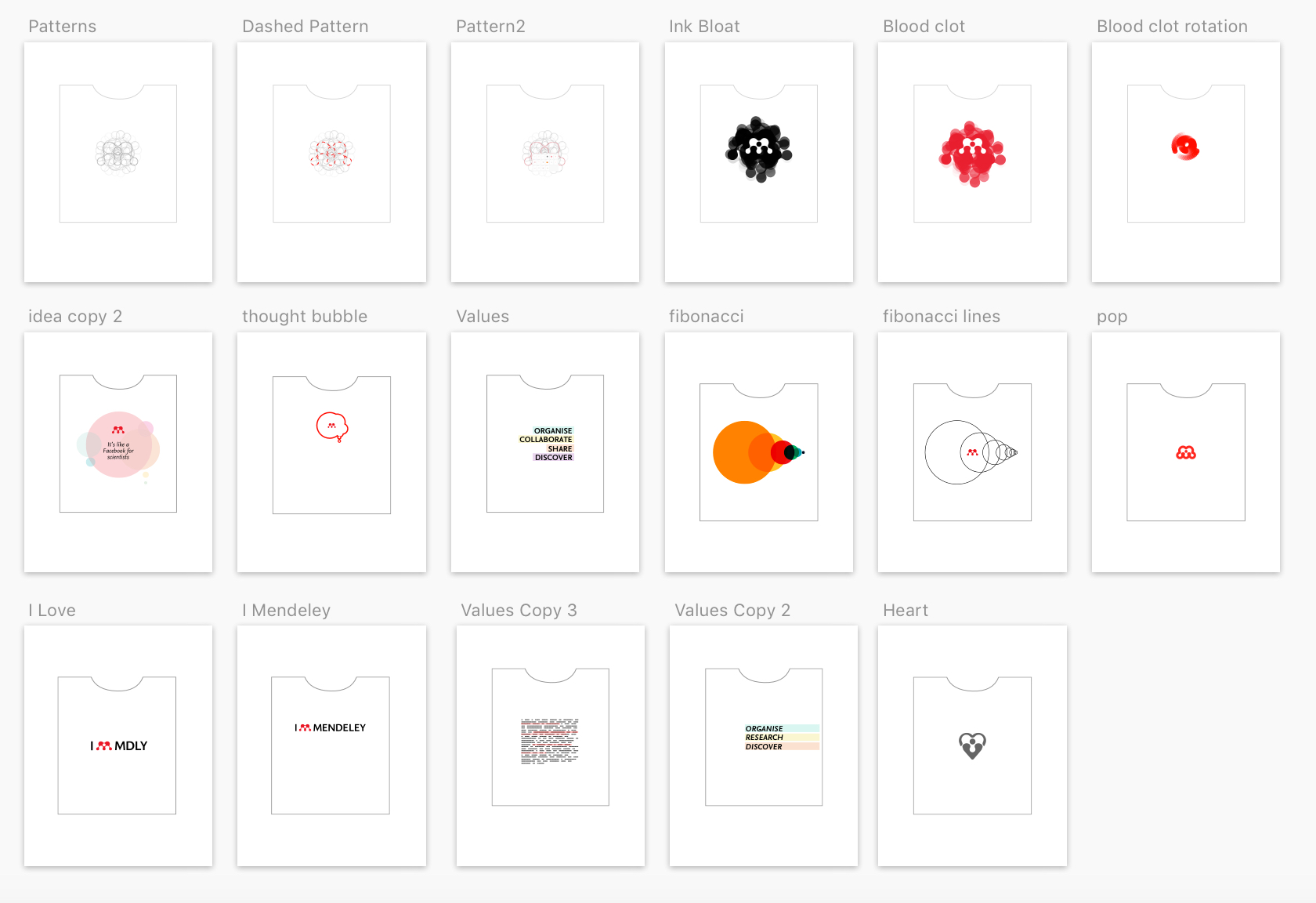
After a morning's session I felt that most of it was for the cutting room floor.
I'd attempted some graphic development using the fibonacci circles we'd used to refine the logo during the brand evolution project, which was fine enough if you're into the abstract geometric art of Max Bill or Joseph Albers, but this was far too abstract for the brief.
I tried out another visual we'd developed, the highlighted text, and set keywords from our brand values within them, yet this wasn't really offering much either.
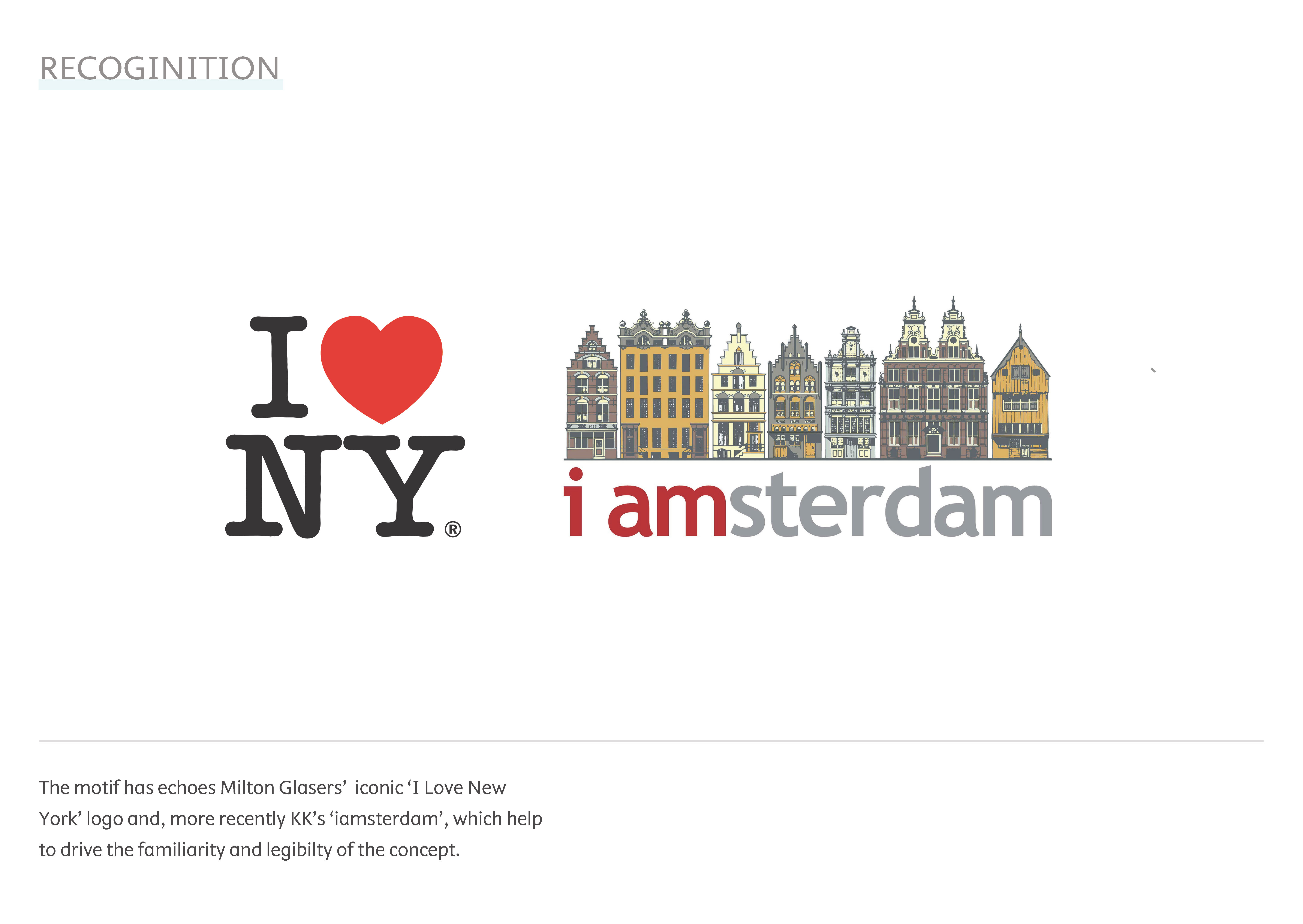
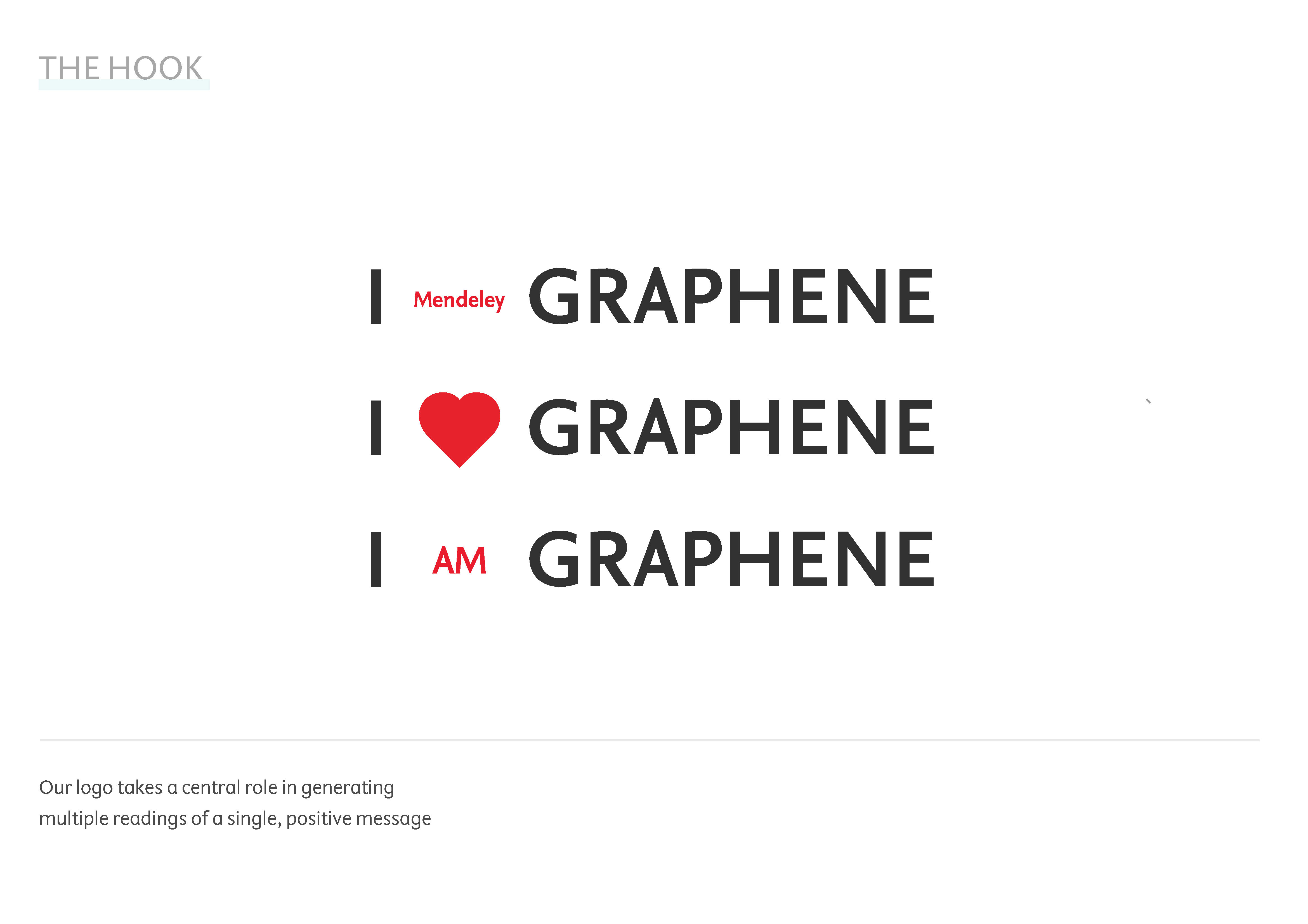
It was then I began playing with different treatments of the logo, given it's colour and form, I began repurposing it as heart emblem.
Something clicked.
The vibrant red we'd recently switch to was really humming in this role and by wrapping some simple messaging around it a solid concept began to emerge.
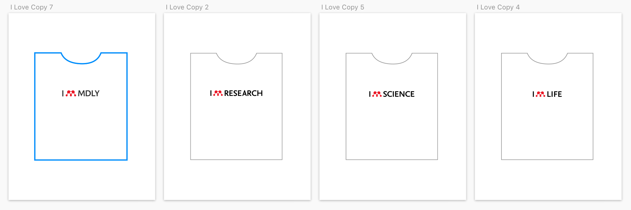
It was here I knew I had something, so shared it back with the marketing team who felt I ♥ MENDELEY would suffice.
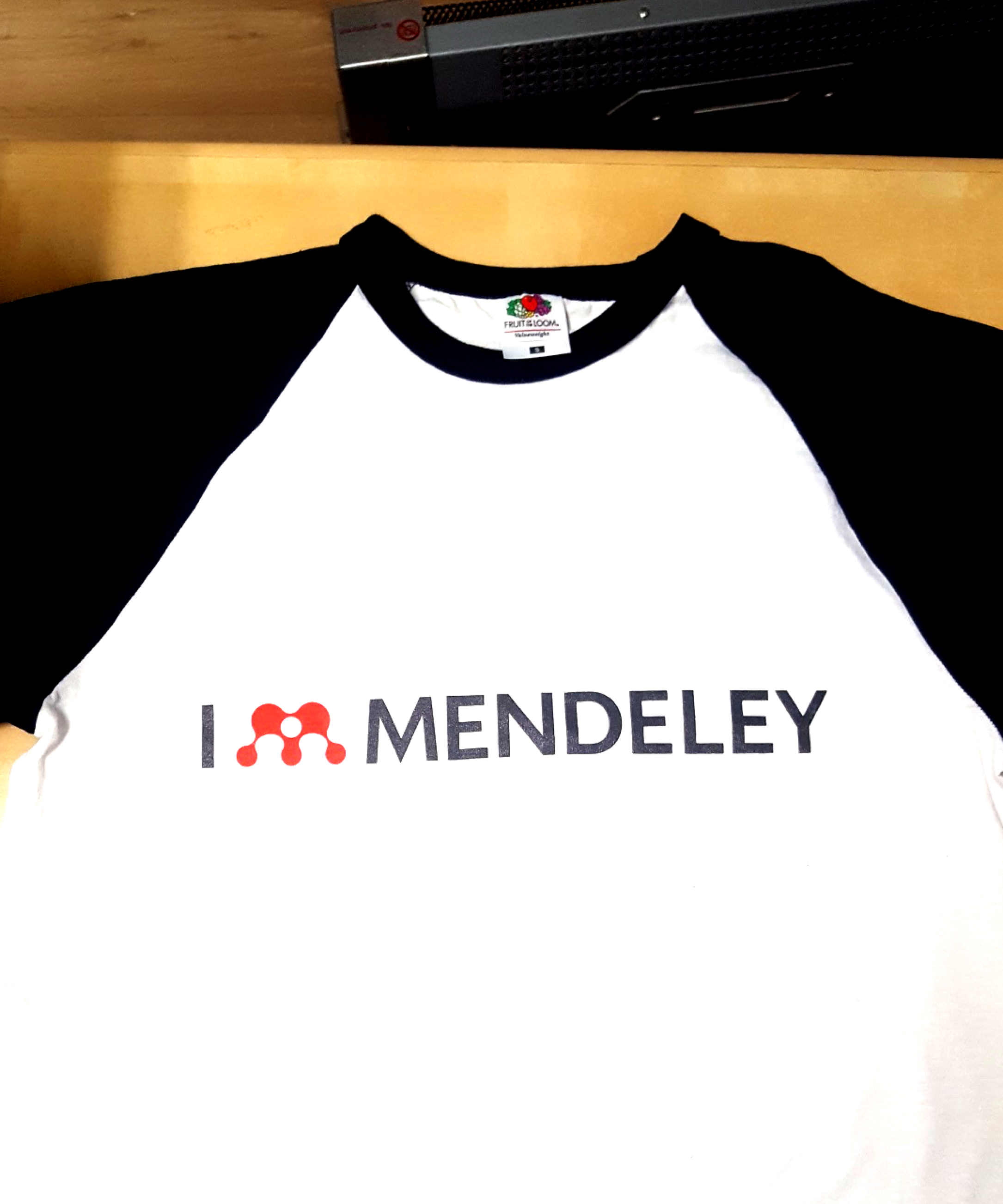
The t-shirt was handed out at Christmas time and most of my colleagues seemed largely indifferent. After all, a 3/4 length t-shirt as a Christmas gift from your employer is a little bit weird, isn't it?
That said, I could see the potential of the graphic idea I'd struck upon and wanted to see just how far I could push it.
Developing the idea
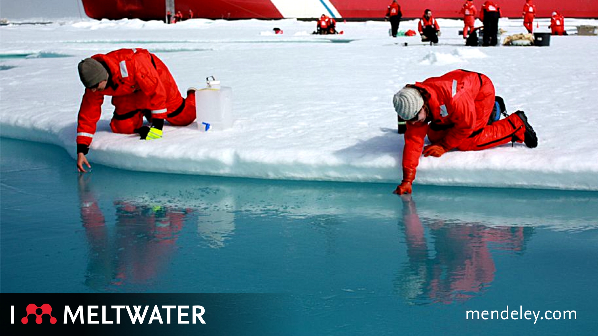
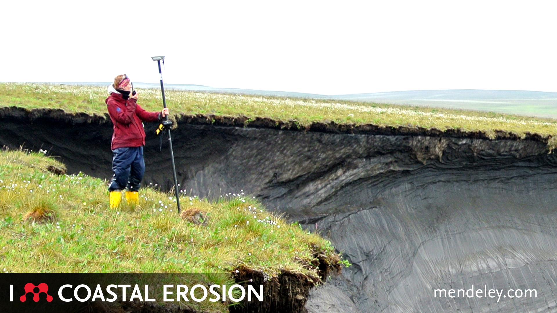
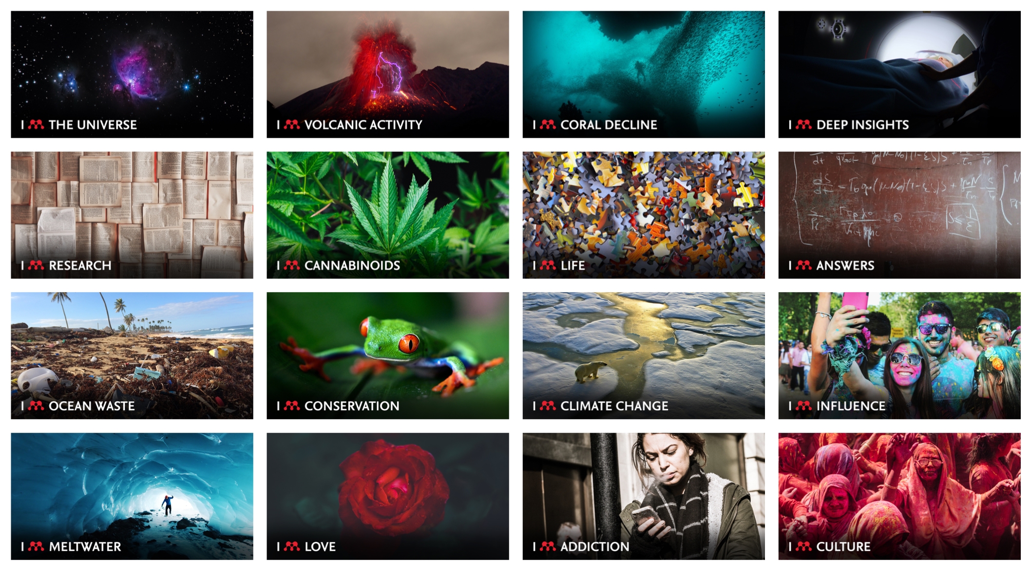
I started exploring how imagery could impact the motif and that kicked things on a notch and had some fun with scientific illustrations
.jpg)
.jpg)
I was enjoying the juxtaposition of message and imagery and felt this could really open up the concept further.
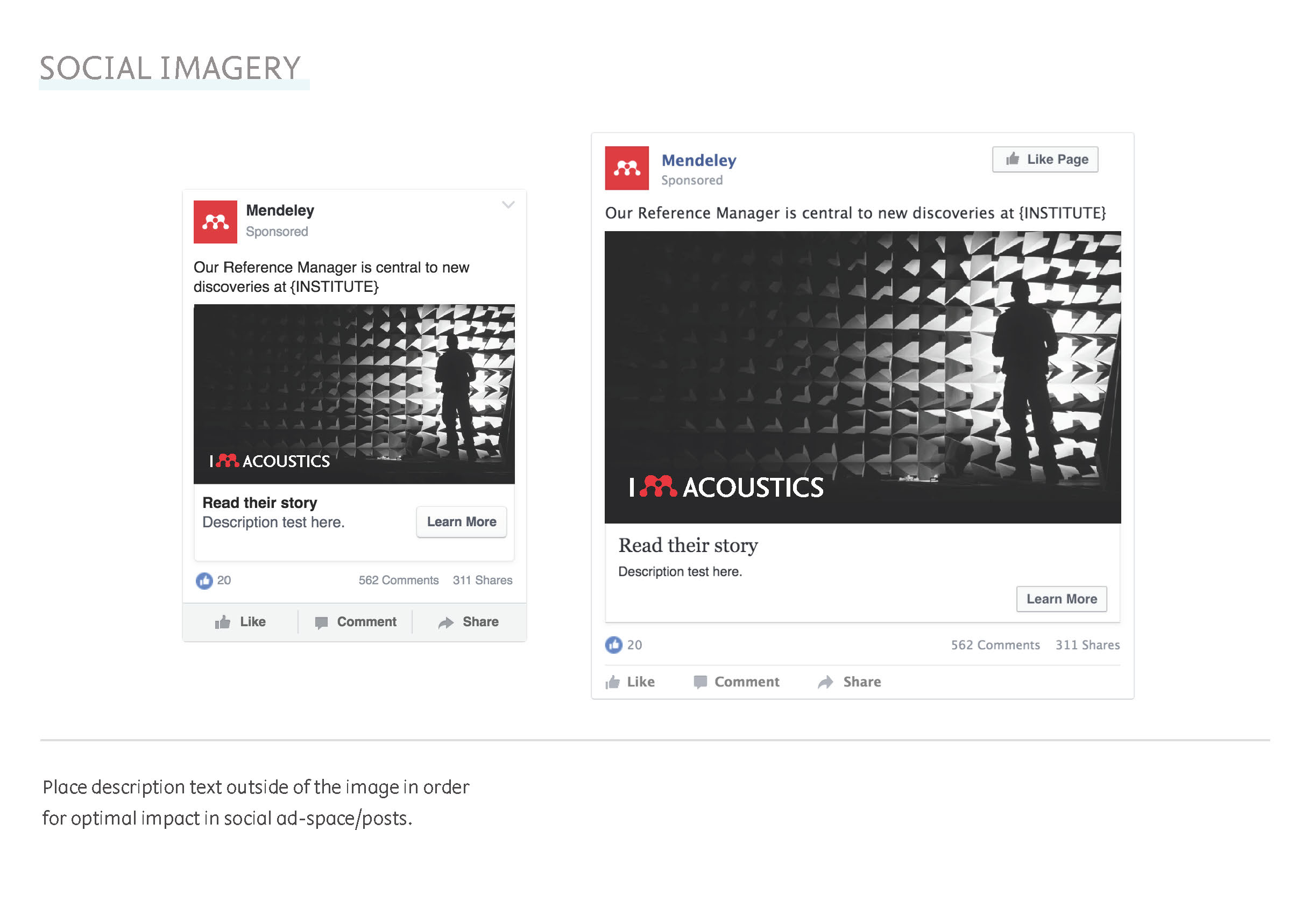
Storytelling
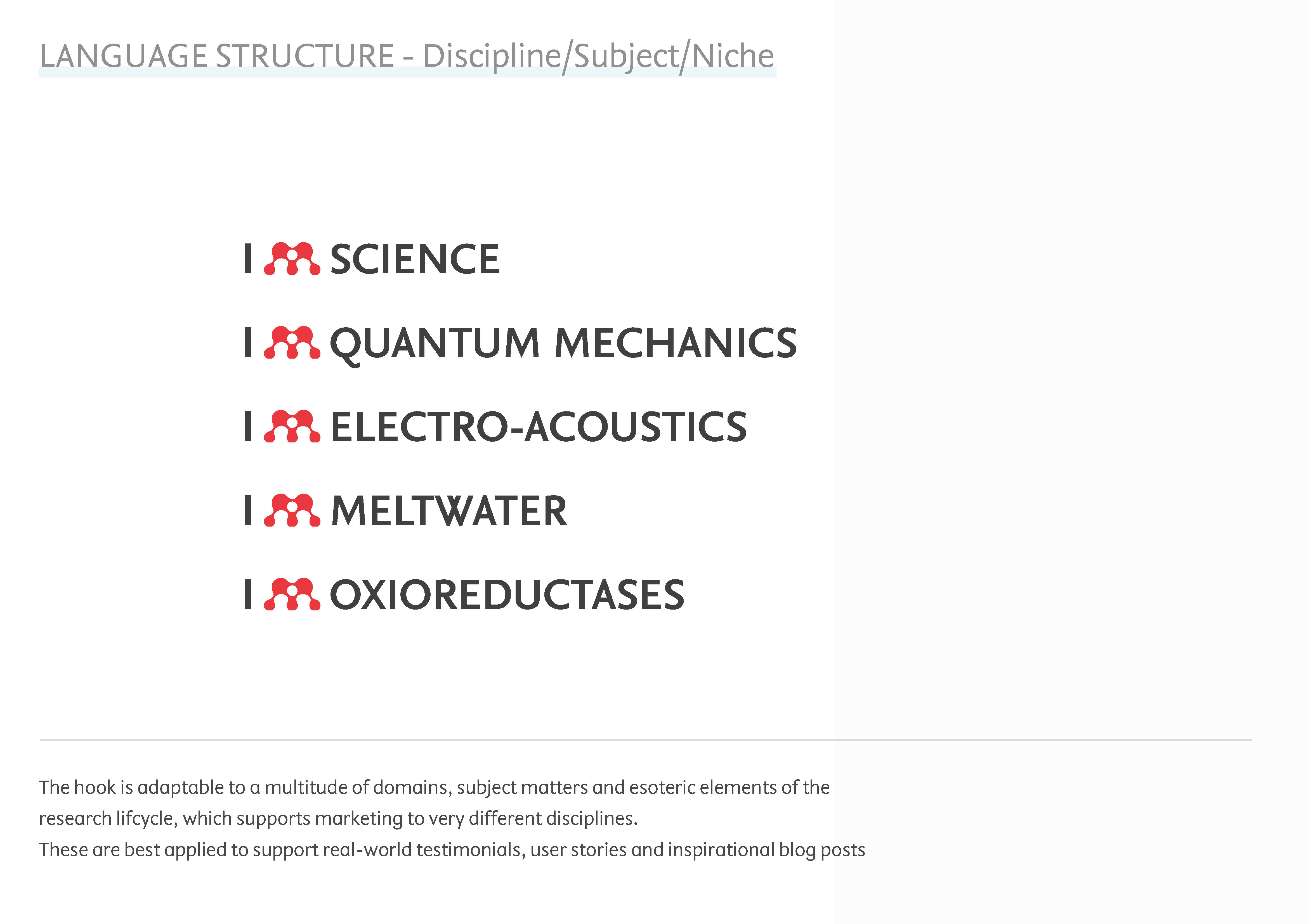
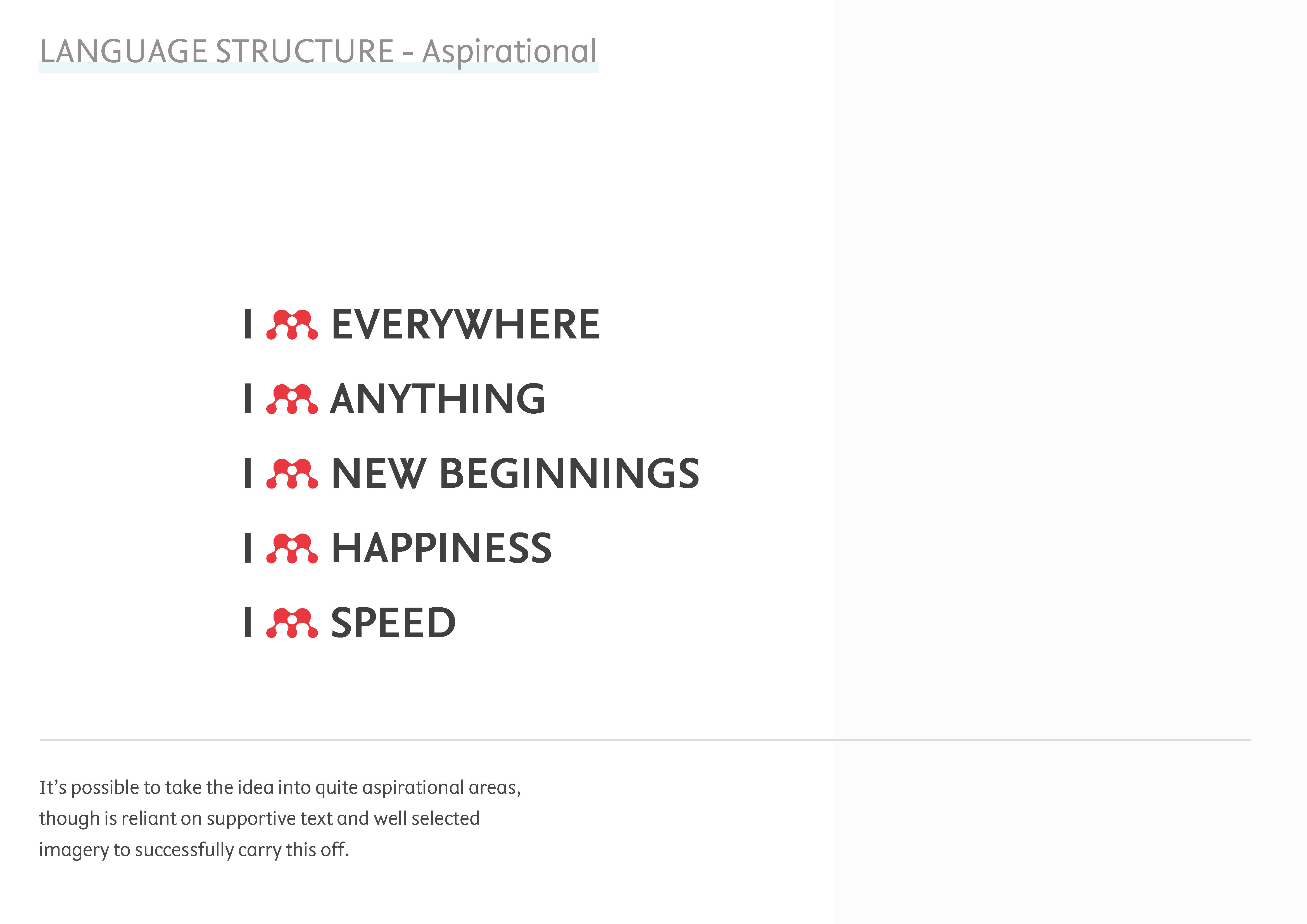
Given the breadth stories we hear from our users, about the diverse (and sometimes bizarre) fields of research in which they use Mendeley, I wanted bring this context to the fore and so began placing the motif against images that together would tell stories of Mendeley's central role in the workflow of researchers, and the impact that this has on humantity.

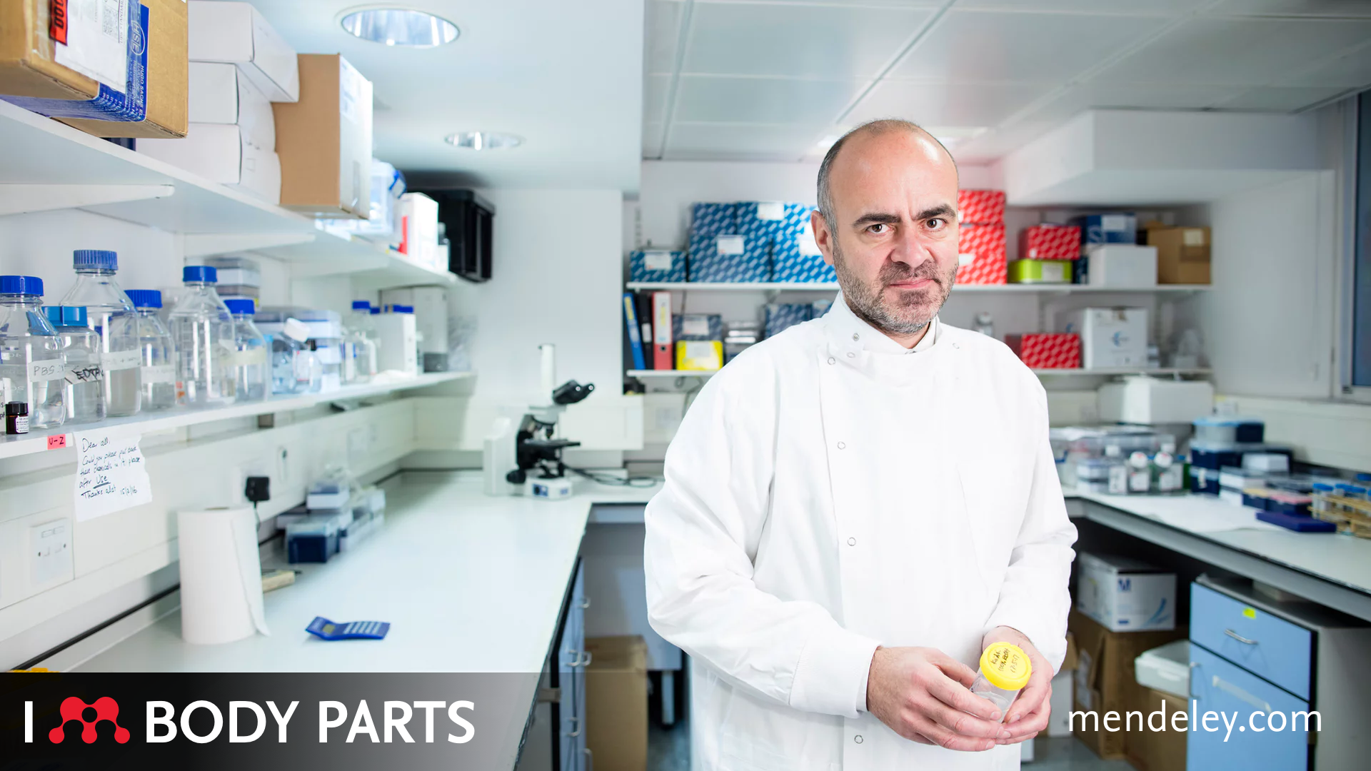
This all began moving in a quite powerful direction and taking an opportunity to share it back to the marketing team, they jumped at the chance to use it.
"This is brilliant and you just saved us thousands! We could use it on walls, put it on our emails. It's great" Marketing director, Elsevier
Based on this resounding approval for the concept, I went in for another round of ideation, to see once again just how far this could be pushed.
Creating the guides
Unable to afford the time to flesh this out further, and with the team regularly using agencies state-side to handle campaign work, I switch from creator to creative director for team to flesh this out further.
After handing over the work and, through the marketing team, offering some support to the agency, it quickly became apparent I would need to fully articulate the thinking to them through a campaign guide, to ensure what they were preparing fell inline with the concept and aims.
Digital execution
With the social media work being handled, I began prototyping the homepage execution.
The existing hero module marketing site had been really difficult to produce imagery for and was not responsively optimal.
As a designer that codes, Within an day I'd prototyped a fully responsive hero slot, with and logo and text motif rendered in a way that empowered teams to create their own straplines without having to go back to design files.
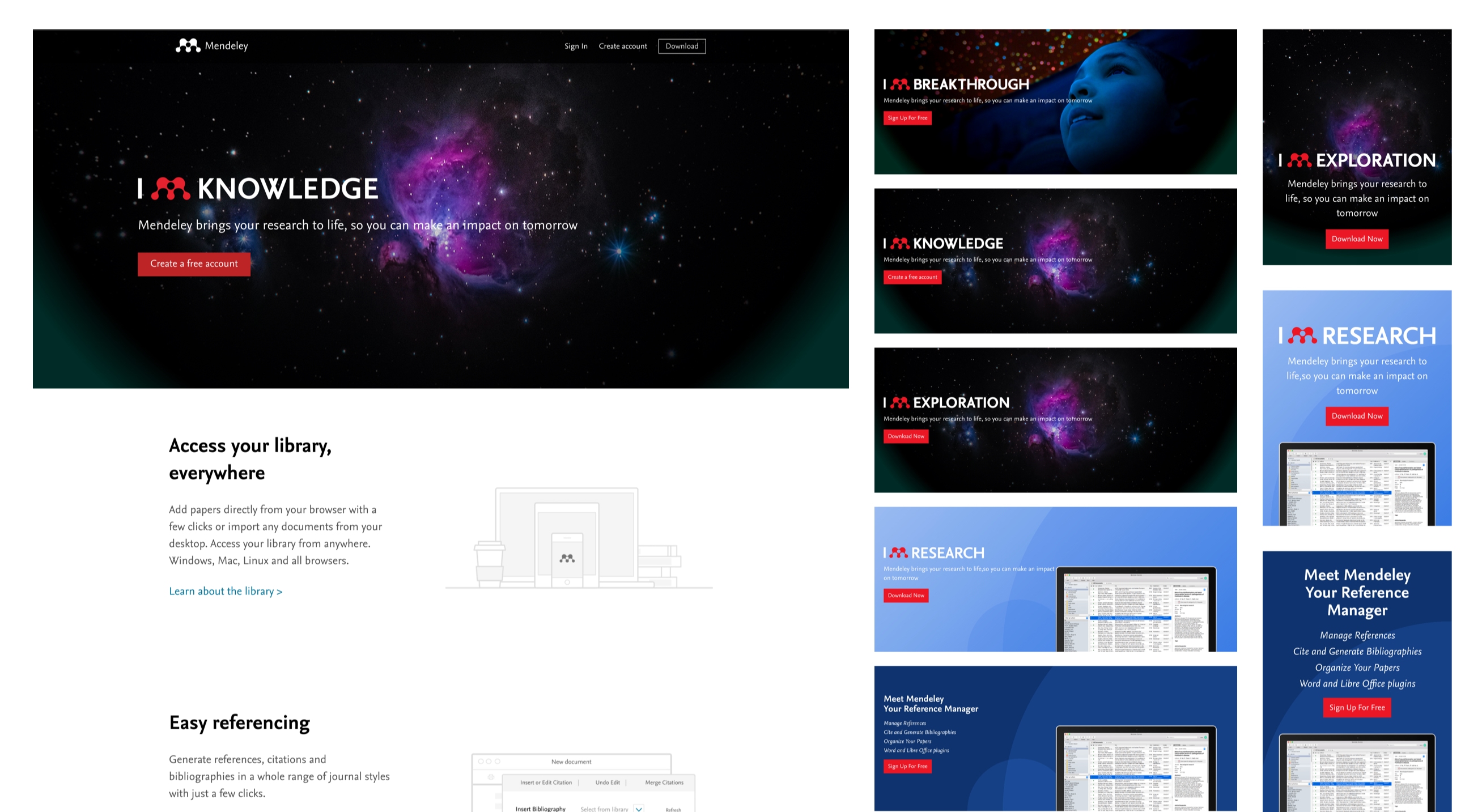
Dangerously, this led to some rather unrefined ideas being put out there in the wild.
Results
At the start of 2018 the campaign launched and as such the social assets saw an increase in engagement across all social channels.
At the same time, our changes to the homepage saw a significant increase in new and retained users and the team continue to test to refine and evolve the concept.
This work has been used on internal coms, promoting the design department and continues to be used in different ways by different departments to promote the products.
