Deciding on labels, terminology and micro-copy had always felt like a creative exercise in product development meetings.
Who would find right words to frame the features heading into production? Who would put a label on the 'thing'? Who would name the baby?
Team members took pride in proposing the perfect words but, oftentimes, time was tight and placeholders became the default.
It's a trivial change... we can update the text later
Without a UX resource prior to my arrival, copywriting was just another task absorbed by the development team.
After an initial review of product and process, I raised concerns and proposed changes but the team downplayed concerns.
It's ok for now. We'll address it in user testing.
As the sprints rolled on, any copy changes were deprioritised over new feature delivery, and the tool became increasingly unintelligible for folks attempting to navigate it..
The Brief
The brief came after a particularly difficult Exec review which brought the issue into sharp focus. The PM was pressed to justify the poor usability of the product and was told in no uncertain terms UX should intervene.
The Task
It wasn't just UX copy that had suffered. Large parts of the original design were discarded during development and I performed this copy review as part of full UX audit covering..
- Ambiguous labels in the interface
- Inconsistent terminology throughout the flows
- Unclear instructions that hindered user action
Approach
Using a systematic, persona-driven approach, I reviewed the application screen by screen, flow by flow. Every inconsistency, ambiguous label, or unclear instruction was annotated in Figma and logged into a spreadsheet, with recommended resolutions.

During this relatively short copy review I logged 80+ inconsistency issues across 4 core journeys.
- Inconsistent way-finding terms
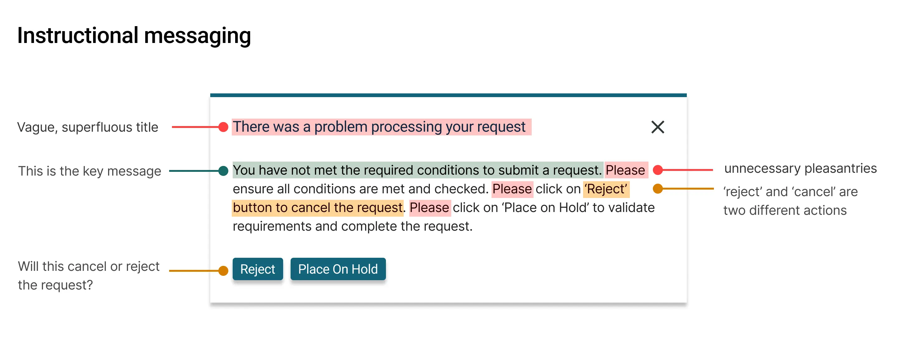
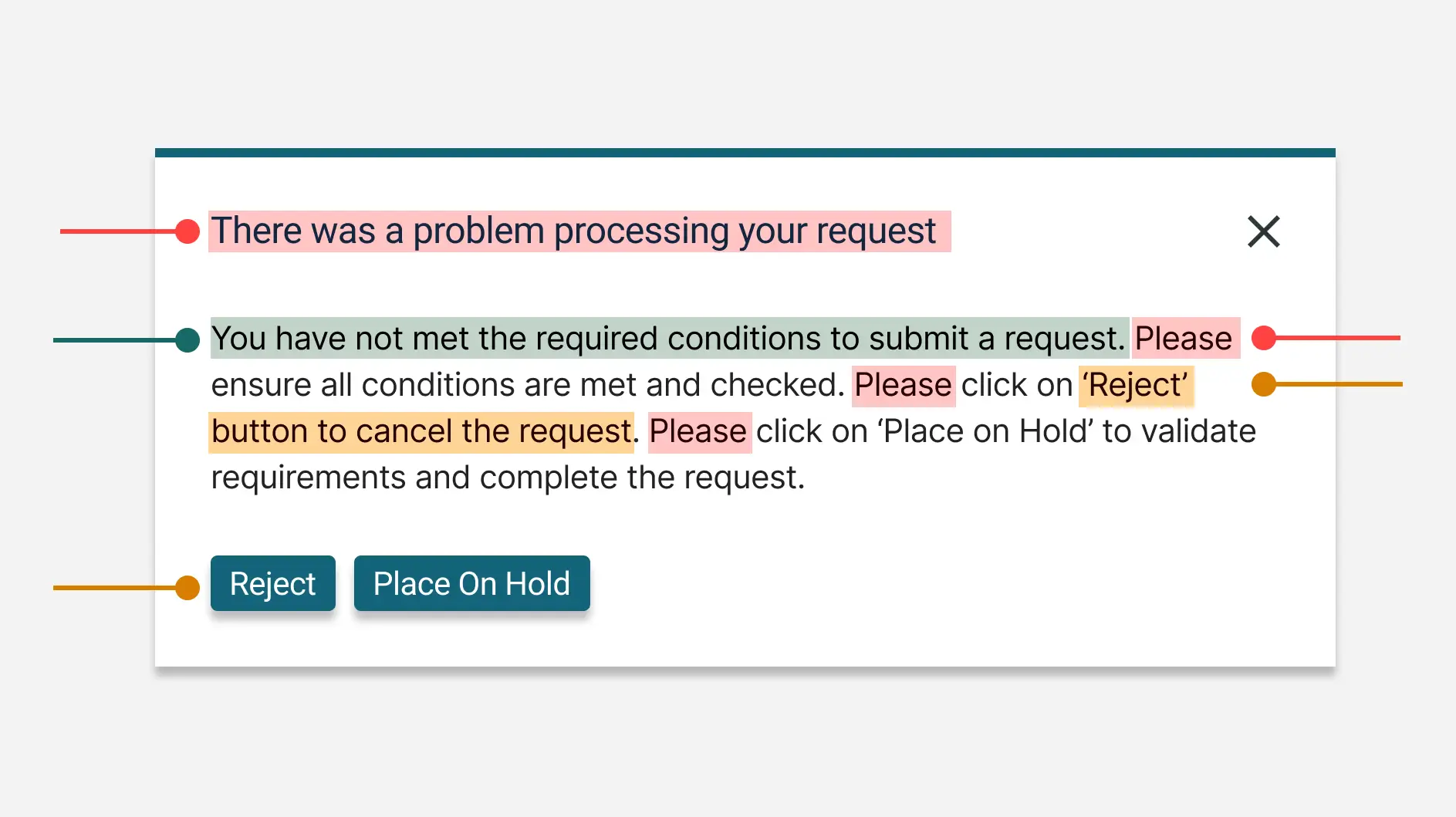
- Vague button labels that failed to convey actions
- Ambiguous input field labels
- Confusing instructional copy
- Misaligned status and stage terminology
My recommendations were discussed, approved or iterated upon with SMEs representing the audience the product was intended for, before taking back to the development team.
Copywriting principles
To ensure long-term improvements, I provided a set of copywriting principles for the team.
- Be Clear Use language that’s easy to understand
- Be Concise Eliminate unnecessary words
- Be Consistent Standardise terms across the product
- Be Helpful Provide guidance where needed
- Be Action-Oriented Frame labels to encourage action
- Test for Comprehension Validate language with real users
- Maintain a Glossary Ensure shared understanding across teams
Implementation guides
Alongside which I offered some basic implementation guides, should the team find themselves without UX support in the future.
- Section Titles / Frame related content clearly
- Descriptions / Offer concise explanations of what’s required
- Input Labels / Specify expected data explicitly
Outcomes
The copy review exposed critical UX debt, resulting in a deep backlog of necessary fixes. This delayed the planned rollout but delivered critical clarity for users and reviewers alike.
Sadly, at the time, the team had failed to acknowledge the severity of the problems they were perpetuating, with a focus on aggressive delivery plans rather than a cohesive user experience.
