In my last position at Elsevier, I delivered a proposal, prototypes and a strategy for consolidating legacy pattern libraries from within their research products portfolio into a single UI Framework.
Though the business eventually proved it was not able to sufficiently support the project at the time, the R&D work I undertook represented a solid set of solutions to a host of problems Elsevier face with design execution at scale.
Context
Elsevier have long been a leading scientific content publisher who, through their many books and journals, have published significant works by scientific luminaries such as Galileo, Darwin and Hawkins.
As well as being a traditional publisher, they’re also establishing themselves as a leading technology provider in the field of scientific research, building digital tools to support researchers in their daily routines.
The organisation is vast and the number of products and projects running through the organisation is mind-boggling.
In the summer of 2018, the business internally unveiled an entirely new direction for its digital research products.
With a sales plan to bundle its software and services in new, exciting ways, I was asked to join a newly-created Core Services team with a loose remit to find ways to bring greater alignment, consistency and efficiency to our product UIs across the portfolio.
Brief
The remit I received was 'to be a conduit between product design, brand and technology' with the long-term intention that this would transpire through the development of a UI Framework and pattern library yet, with daily signals within the organisation contradicting exactly which products and brands would to combine, this was going to be far from simple.
Approach
Like many at the time, the clarity of requirements and expectations were vague yet the deadlines we real, yet with this role was largely unsupported until proven to be vital, I felt it important to research a clear brief and define the problem.
Initial Tasks
I began with user interviews - designers/developers on where they see the problems and concurrently identifying key individuals who had potential to become contributors or team members should we achieve the support from their product teams.
With their thoughts and ideas, I created problem statements that would help us frame the challenges we face and any solutions we may arrive at.
Concurrently I was conducting industry research, observing trends to what we could learn from the current generation of design systems in the industry.
This was presented to the team during our inception a month later, articulating the possible scope of the work and the need to educate the business on the purpose of a UI Framework.
- What are the problems?
- What is a UI Framework?
- What are the benefits?
- The ROI?
- How could we tackle this?
- Where would we start?
- What staffing would a UI Framework require?
A Confluence destination was created for research and documentation as I began to flesh out the problem and the work ahead.
Restating the brief
Given the context of the situation we were in, with each product team working to their own pace and processes, it was clear this could only be a future-facing piece of infrastructure to support the new platform ideas, rather than anything that could help the rapid delivery of MVP.
Under these circumstances, the brief I restated was to research, plan and develop a resilient, adaptable, brand and product agnostic UI Framework that could support the business in new experiments, while bringing product teams to form a common approach to the design and execution of our core products.
Planning
With support and feedback from the stakeholders, I planned a 6-month program of work for design and development to undertake.
Designing workshops and processes to acquire information, learnings and best-practise from a dispersed workforce whilst beginning to set standards on how we conceive, create and maintain shared designs across such a group.
Across the 6 months, the tasks program of work looked like this…
- Visual Inventory
- UI Audit/review of core patterns
- Consolidation/validation of common patterns
- Vision Screens/Divergent exploration using new patterns
- Consolidation/validation of exploration
- Refine documentation/process
1# Design System Workshop
As well as driving conversation between the dispersed designers, I began conversations with developers from the wider business to see what we could leverage from elsewhere.
A number of differing approaches to pattern library development were in play around the group, all with war stories to tell.
Recognising the value in this knowledge, I designed a day-long workshop for teams to come and share their experiences of working with pattern libraries, also attempting to achieve consensus for a path forward.
The day looked like this..
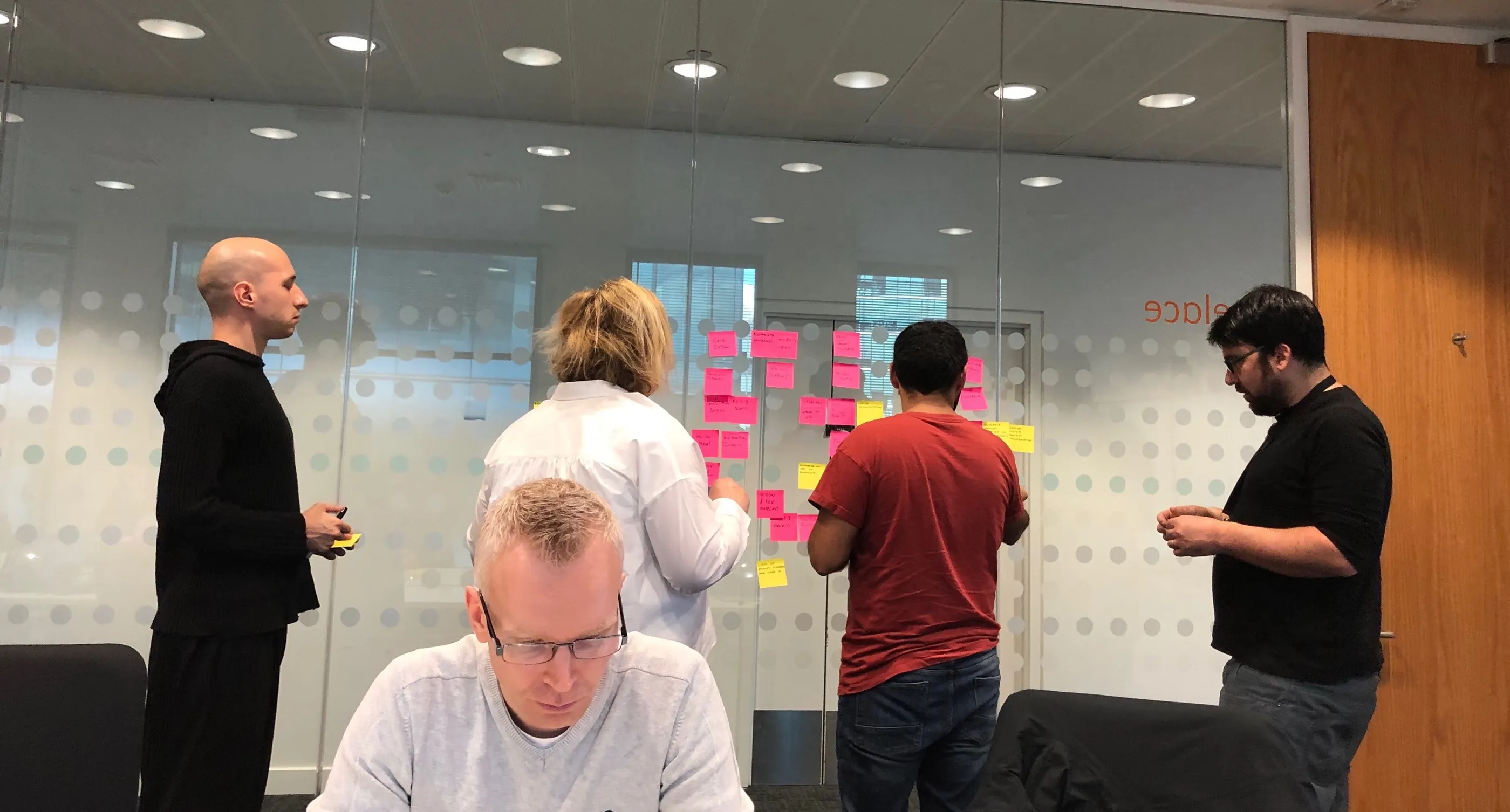
During the day, I ran a series of tasks aimed to tease out the needs we have and, in building out a design system for such a large group, just what kind of challenge we'd be taking on.
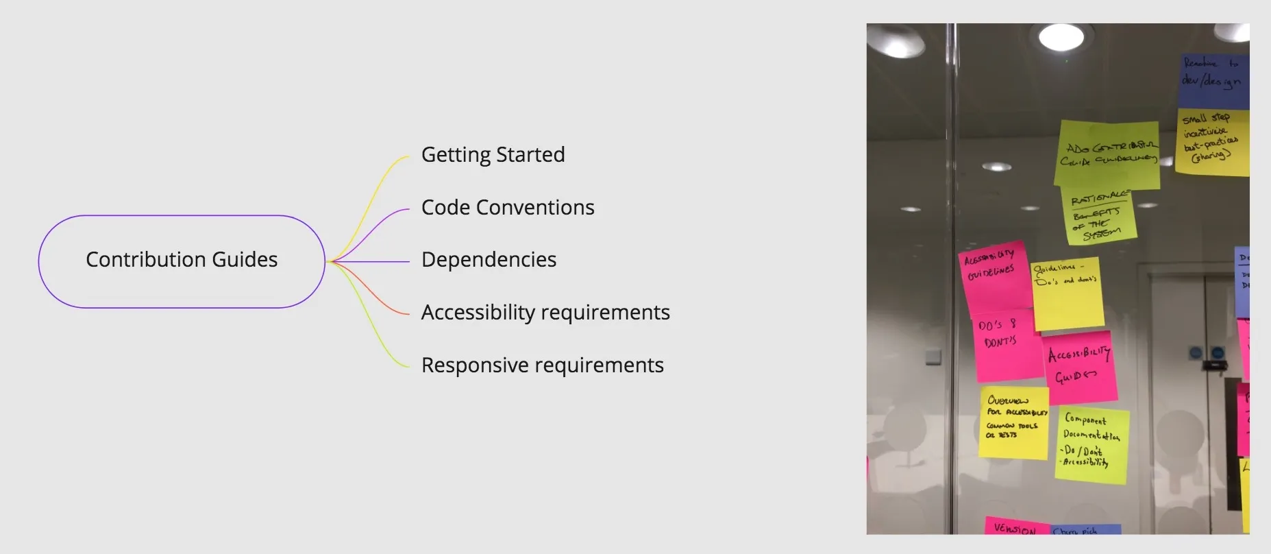
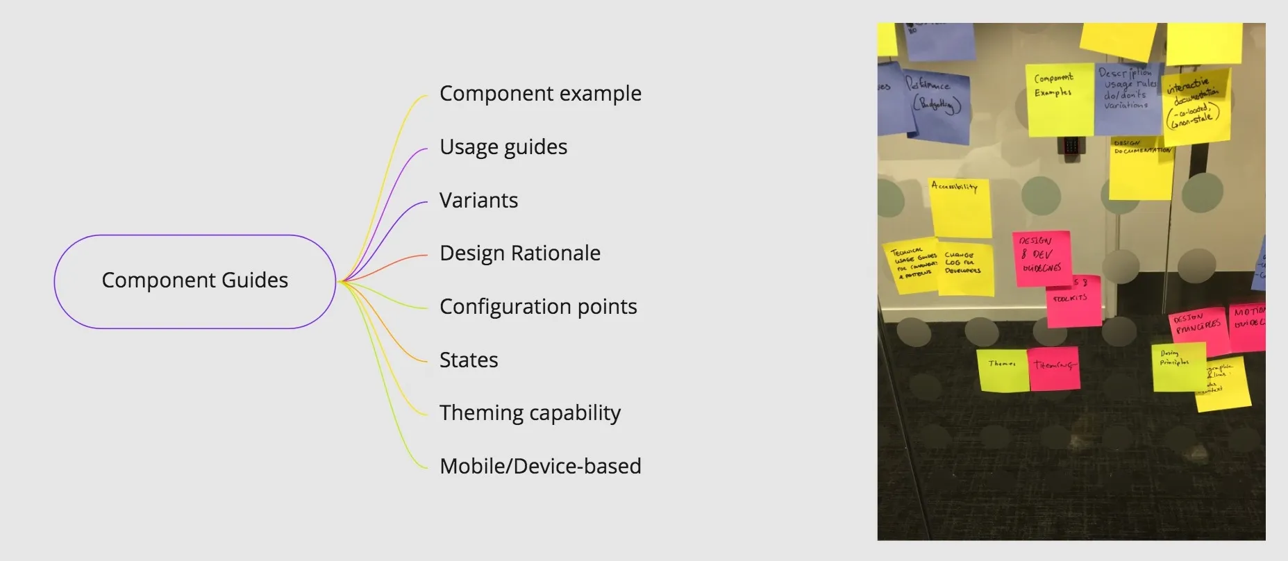
The first was an affinity mapping exercise, designed to tease out the types of guidance we may need to provide, which provided the structure for a proposed IA structure for the documentation site.
The second was a task devised by Nathan Curtis on design system documentation that help to highlight the sheer volume of documentation that would be needed to roll out a successful design system.
The day generated lots of great discussion, surfaced some common problems teams had faced as well as highlighting the sheer magnitude of the task we faced going forward.
2# Visual Inventory
Despite the lack of clarity around just exactly how the products would eventually come , we knew we'd be relying on the good work that teams had been delivering up to this point and that we'd like to share code and designs, so the first team activity we kicked off was a visual inventory.
I invited designers from each of the 12 teams to add 5 key screens from their products into a Miro board to provide a birds-eye view of the product-scape. This came very quickly and provided great insights to kick-off discussions.
Despite great alignment with the basic branded UI elements, there were, critical divergences around layouts, content presentation and the concepts and metaphors we use to design our interfaces.
To drill deeper into the themes, I then surveyed the group to generate a data-driven overview of which UI elements were integral to each product, which I developed into a prioritised backlog, based on usage data.
3# UI Alignment program
In order to begin bringing designers around the common approaches to UI design, I began hosting a weekly video-call to surface, discuss and co-ordinate UI initiatives with those responsible for delivering UI with Elsevier Research products.
Designers, POs and engineers from 4 time-zones joined to listen and share knowledge, best practises, surface live issues, showcase processes, discuss experiments, new requirements and possible efficiencies we could bring to the team.
Using the themes from the visual inventory as the driver for these discussions, we began creating consensus about how we could approach the work.
I initiated a steering committee to ensure consensus and diplomacy was in place as we began looking to distribute design tasks to working groups.
At this point, it was clear these activities were hitting some raw needs within the design teams.
Hi Dan. Don’t think anyone acknowledged your hard work and what I thought was great foresight. I am so happy someone it tackling this. UX Lead, Scopus, New York
Headway
These initiatives were certainly helping to generate greater awareness of teams duplicating efforts both in design and development yet, with each team deep in critical delivery mode related to the new business strategy too, they didn't have the bandwidth to cover work on a central piece of future-facing, foundational infrastructure.
Whilst I was really keen for this work to come as a team effort, the team just weren't available to focus on anything but the product s they were directly working for.
For me, this represented a massive problem for the task that was laid out to me and a clear disconnect between what the business wanted and how it was going about it.
Despite regular conversations with the product owners and core stakeholders on the issue of resources and with nothing forthcoming, I took matters into my own hands.
Prototyping with CSS Grid/CSS Variables
As a designer who codes, it's all too easy for me to fire up a text-editor and start prototyping and what was really needed to demonstrate the possibility and value of this work was something real and tangible. The discussions, theory and concept was all well and good, but what we needed right now was something that the business could really grasp the impact of.
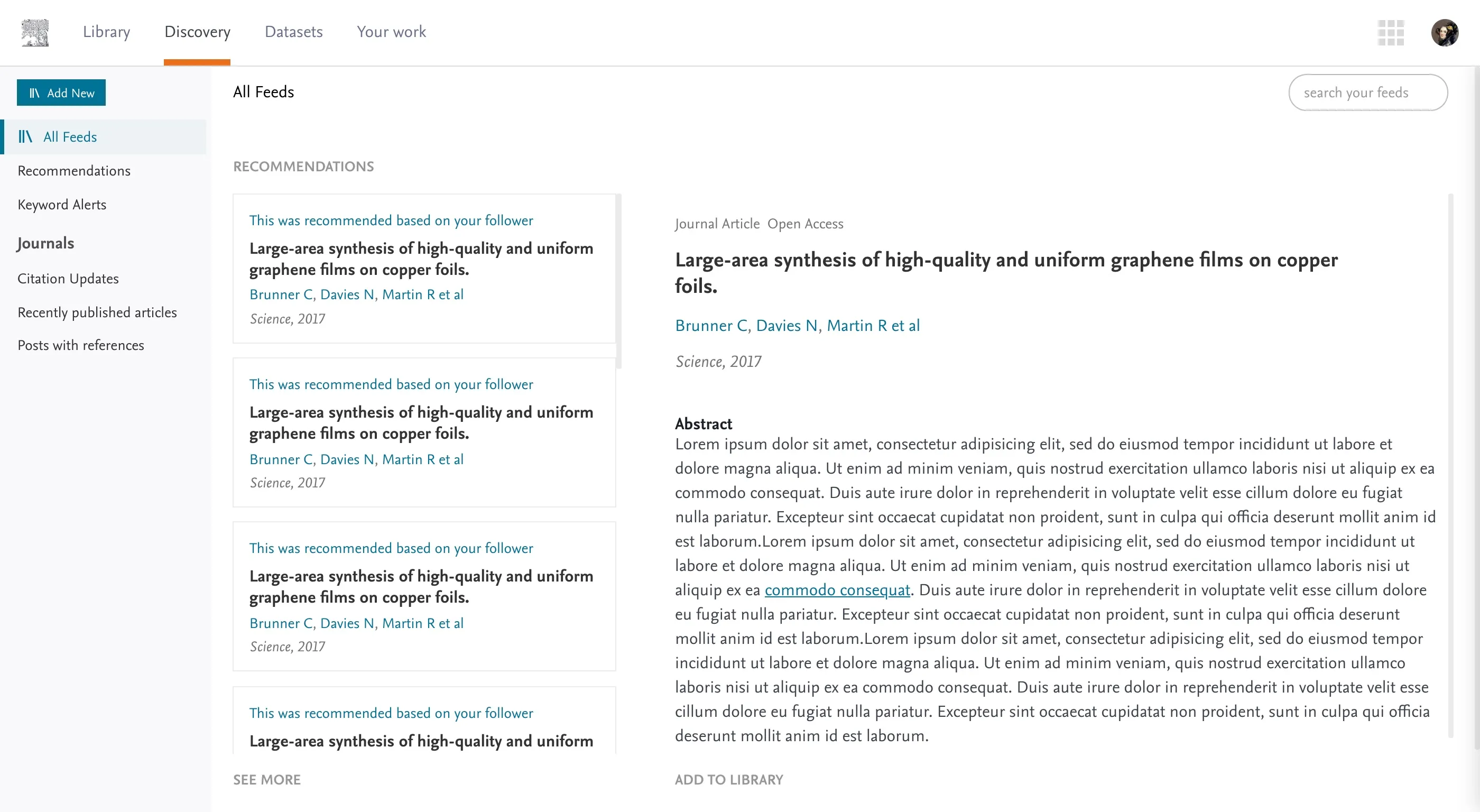
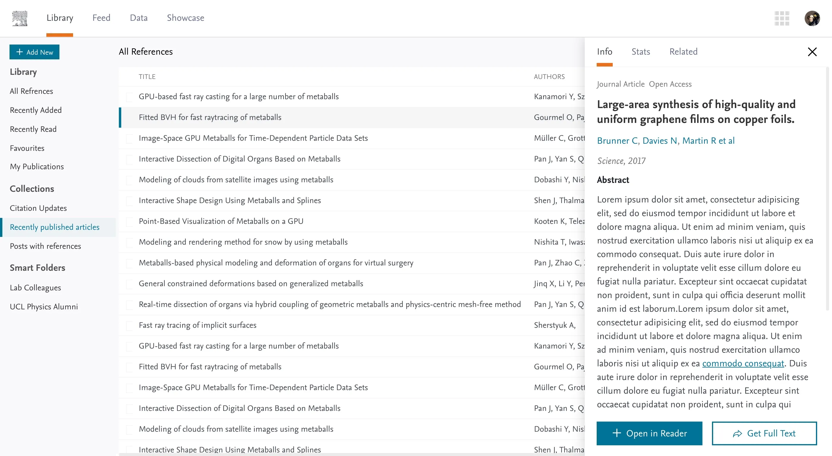
Utilising the work we'd previously laid out in the Mendeley design refresh and keen to explore ideas on how we could handle space, typography and content density using CSS variables as design tokens, I began building prototypes to aid discussions and demonstrate the thinking.
With just the simplest of set ups, I began working up some of the core patterns that we needed to align on, some CSS formulas and techniques that are helpful for maintaining consistency and efficiency across different products.
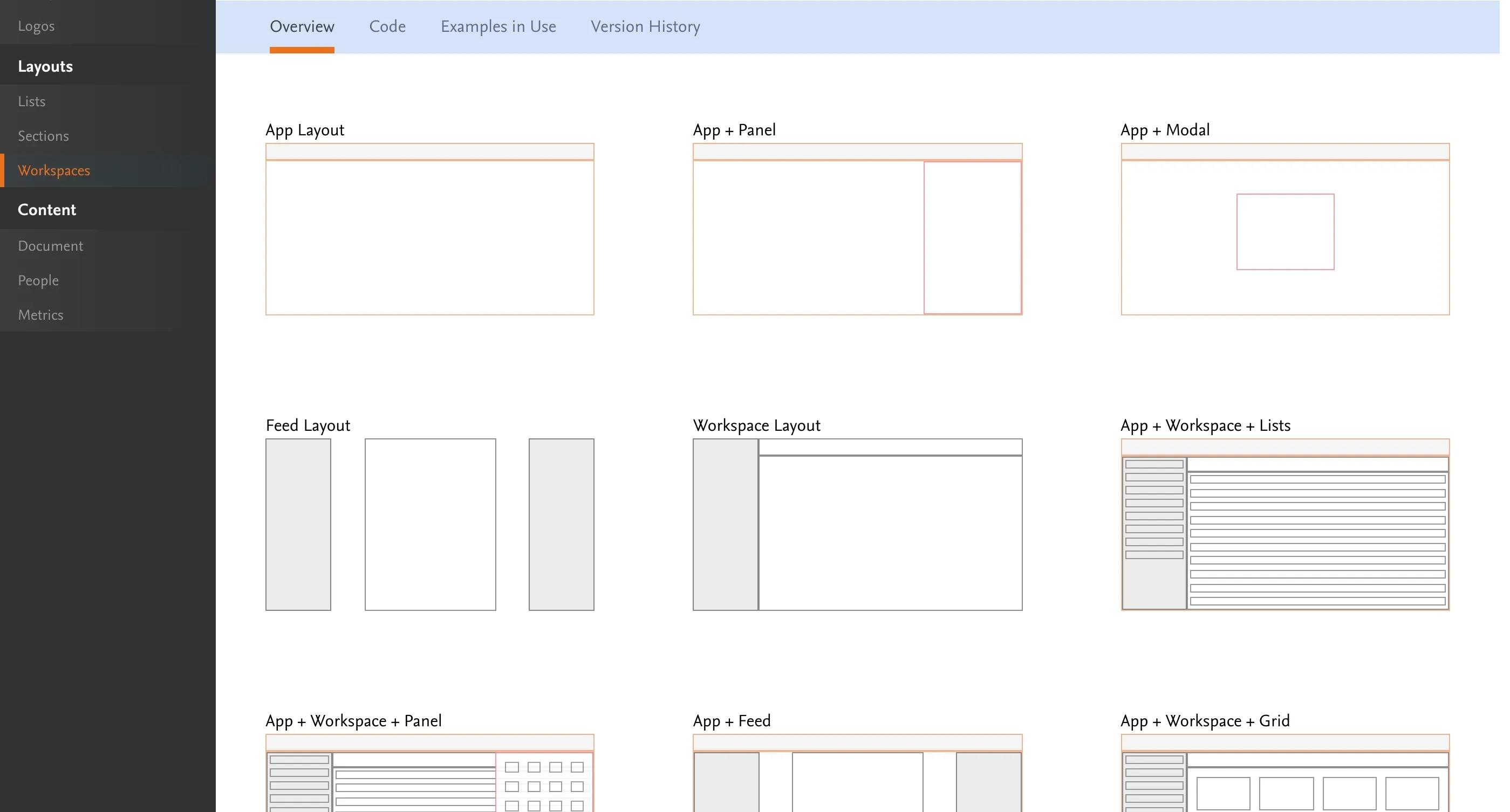
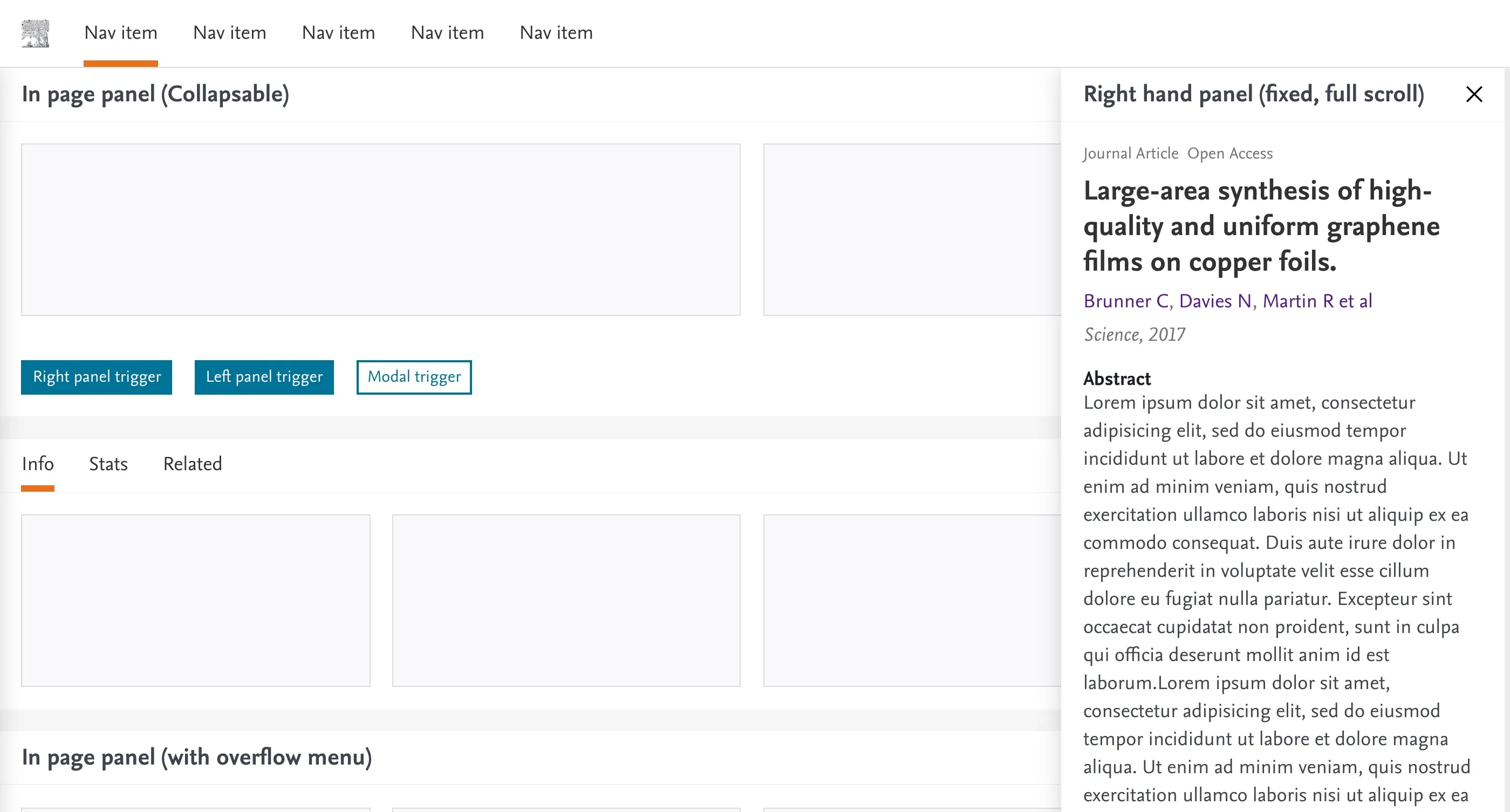
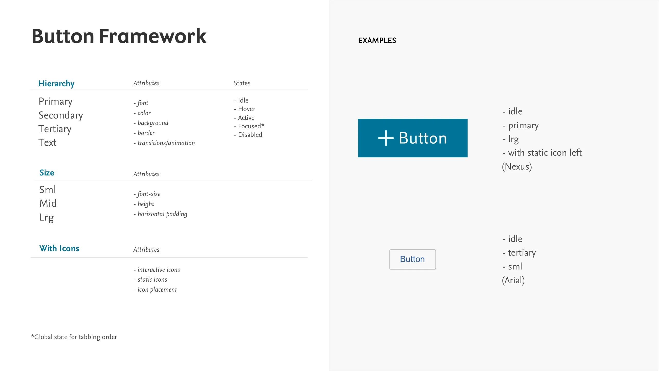
I love breaking apart designs into reusable formulas and systems and had already created a self-contained Button Framework, a series of generic layouts, a series of core content patterns (and variants) along with some ‘semantic styles’ that helped reference and reuse common styles rather than rewrite styles over again.
Business update
The prototypes had deliberately set out to answer issues unearthed from the visual inventory.
Layouts, spacing consistency, content density, typographic efficiencies, theming, legibility, accessibility were presented through a carefully scripted presentation to highlight the benefits of refactoring our products in such a considered manner.
Alongside these, I represented the extrapolated savings that could be made by investing in the project, with 3 simple slides that seemed to have everyone either nodding or gasping.

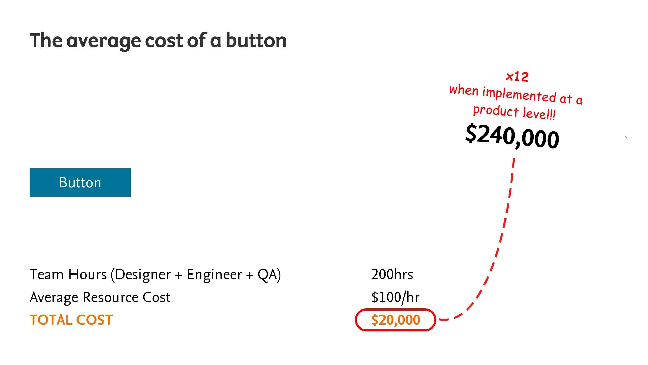
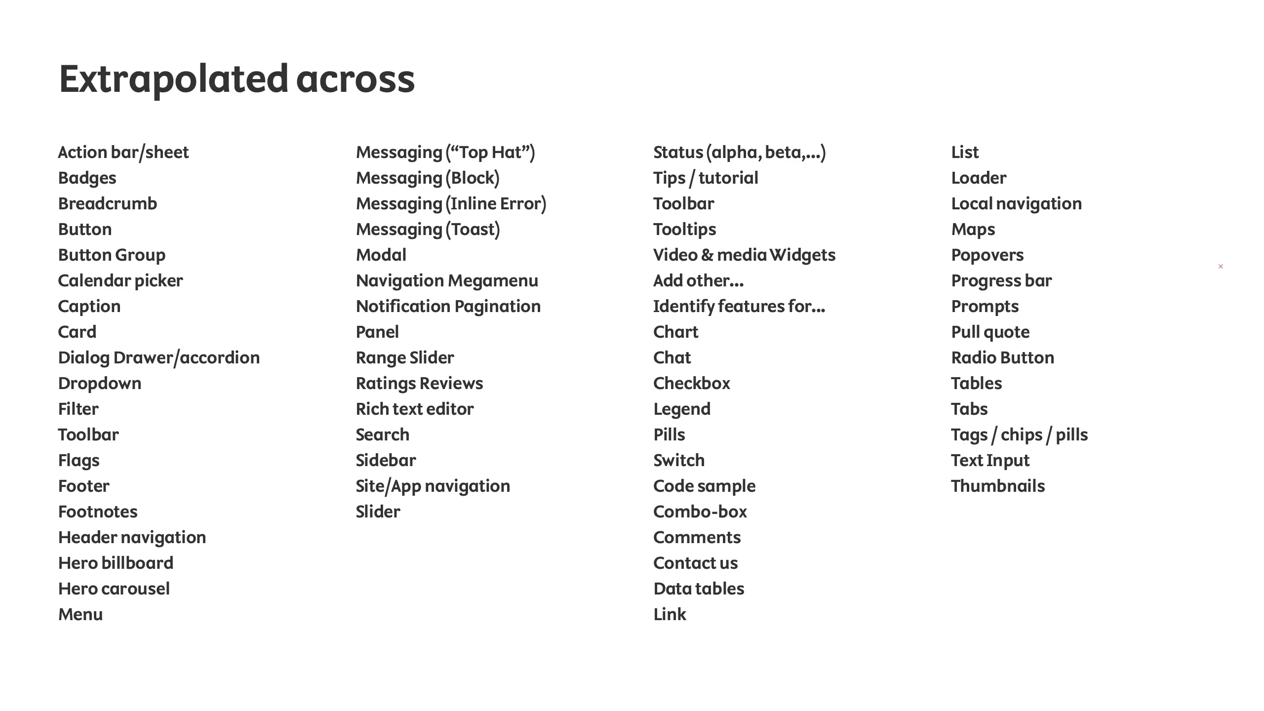
Yet, despite such great feedback and support from a majority of individuals, the project failed to gain the necessary support to move forward.
Reflections
Elsevier are a massive organisation in the midst of a huge transition.
Set against the business backdrop, it was always going to be a tough to get an organisation of thousands to buy into a change in strategy of this scale.
When it became clear that a dedicated team wouldn't be available to support this initiative, I knew this would be more of a preliminary piece of R&D, rather than something that I would be able to deliver in my time.
The research, the proposal and the prototypes were a well-designed solution that the business desperately needed, and delivery teams were crying out for.
Somehow, in an organisation of this size and scale facing an uncertain future, such a vital piece of product design infrastructure wasn’t a critical priority.
Despite the obvious disappointment that I was unable to have progressed this project further, I'm excited to take the experience, skills and learnings with me into new projects.