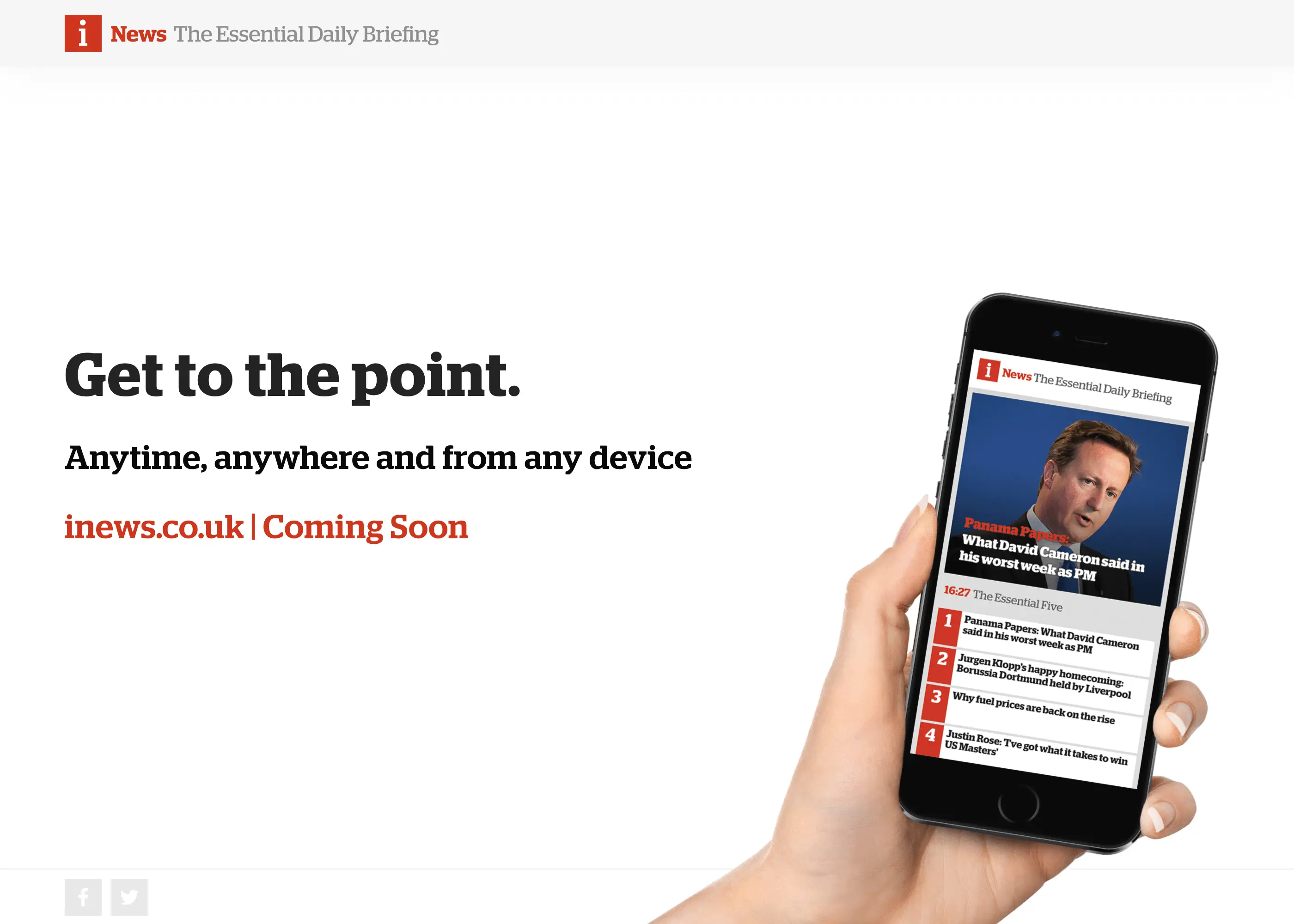
Late on February 10th, 2016, news of an impending deal for Johnston Press to buy the i Newspaper from ESI Media emerged...
With no dedicate website prior to the purchase, part of the immediate value the business felt it could add to the acquisition was a modern, responsive digital destination.
A dedicated website is a great opportunity for growth Ashley Highfield - CEO
The Brief
It was at this point I learned from the CCO, my boss, that he'd created some visuals of a possible homepage, to help the shareholders imagine the possible benefits of creating a new website for 'i' and this provided the basis of the brief.
I was asked to prototype concepts within a week and deliver designs to the development team in Romania the following week.
Many would've no doubt recoiled such a brief, however, in the 12 months prior to the acquisition, I’d worked tirelessly with our product and design teams in-house and with our off-shore development partners to design and incubate a responsive, modular UI framework, the JPDNA, in order for us to become quicker and more efficient when consistently delivering layouts, features and sections to our large portfolio.
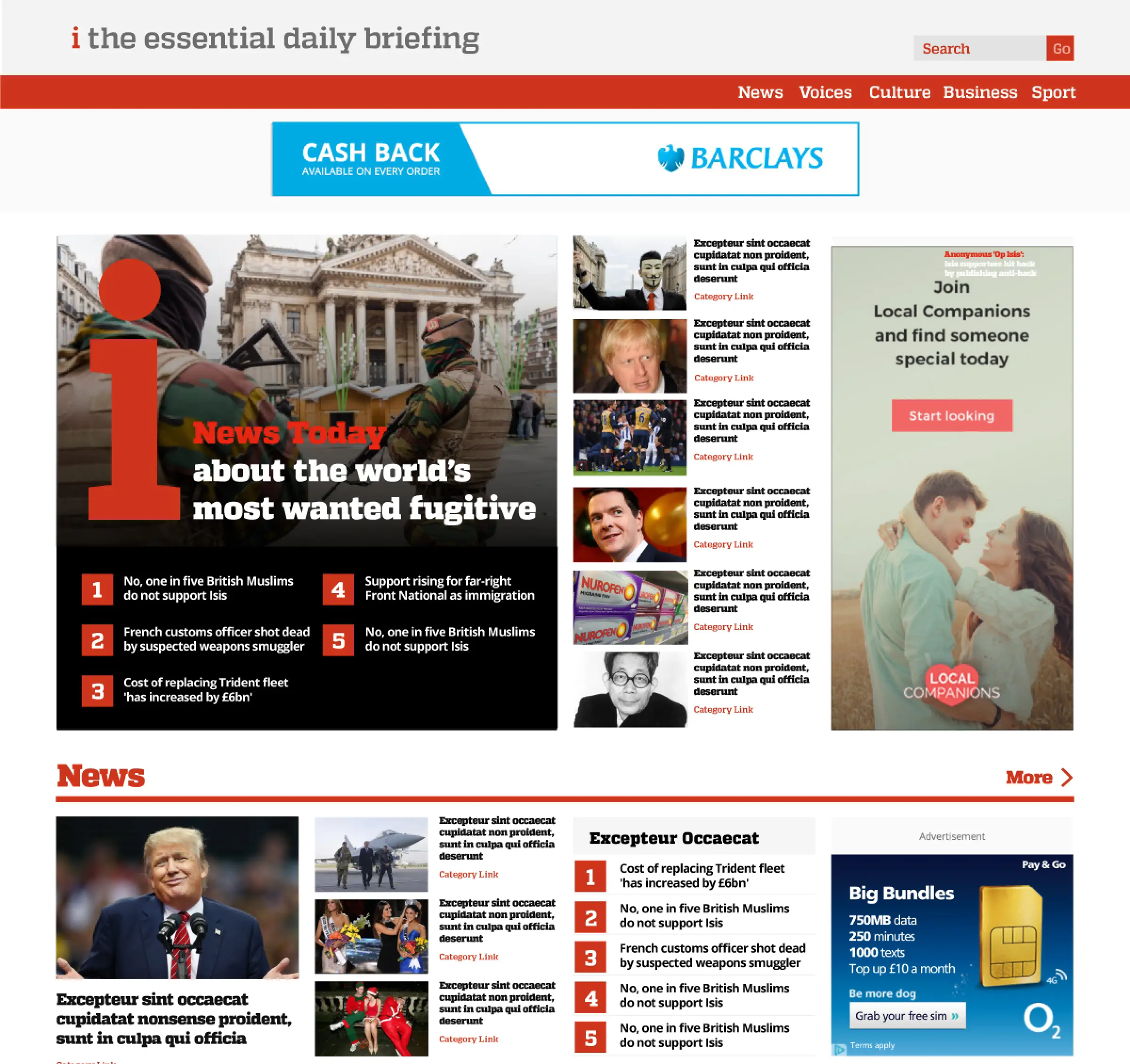
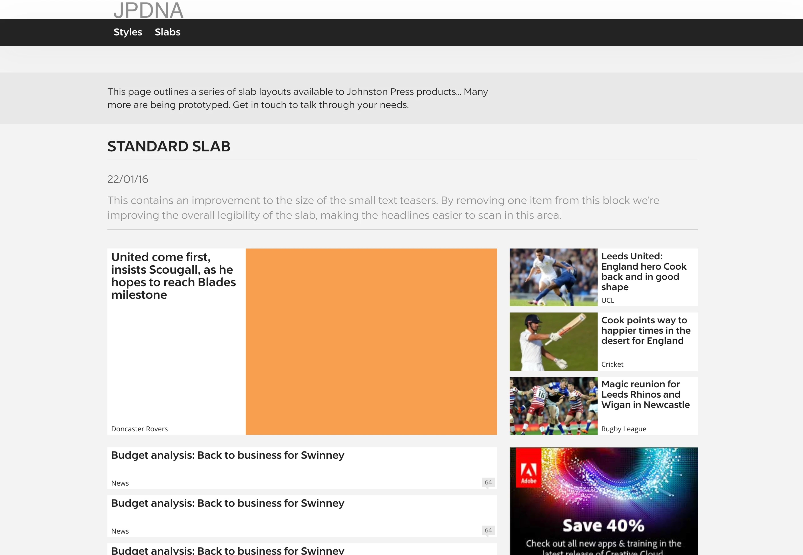
The pitch designs showed a new theme applied to the responsive layouts and UI controls we'd developed for the portfolio and as we'd already launched the Scotsman, Yorkshire Post, Portsmouth News and Sheffield Star the business was at last beginning to see the benefits of this systematic approach.
At the time of the announcement, we were in the midst of refining the theming capability and deliver process to rattle out the 180+ other news sites so, believe it or not, this actually felt like a whole lot of exciting, positive pressure for the project and confirmation that the business felt it could leverage the system as part of the acquisition.
Interrogating the brief
With the editorial proposition quite unlike any other news brand out there, values of 'brevity' and 'impartiality' were to be a breath of fresh air, to be presented with a fresh, clean and modern approach to news.
The high-level product direction was this was to be less about minute-by-minute news commentary but more about quality information and insight.
There was also a strong desire to replicate the popular ‘News Matrix’ print feature online, with our CPO providing some pretty leftfield ideas about how this could work.
Aside from this though, a small digital product/design team were entrusted with the challenge to bring a national news site in record time.
With the site to be ready on the day the deal was to be concluded, just six weeks later, we needed to rely a little on expertise and intuition than upfront audience research.
Designing in browser
With the brief, deadlines and expectations set and no time to lose, I quickly fired up a local prototyping environment and rapidly begin work on defining the theme and fine-tuning templates.
With a clear desk and just a few days, the 'i' began to emerge.
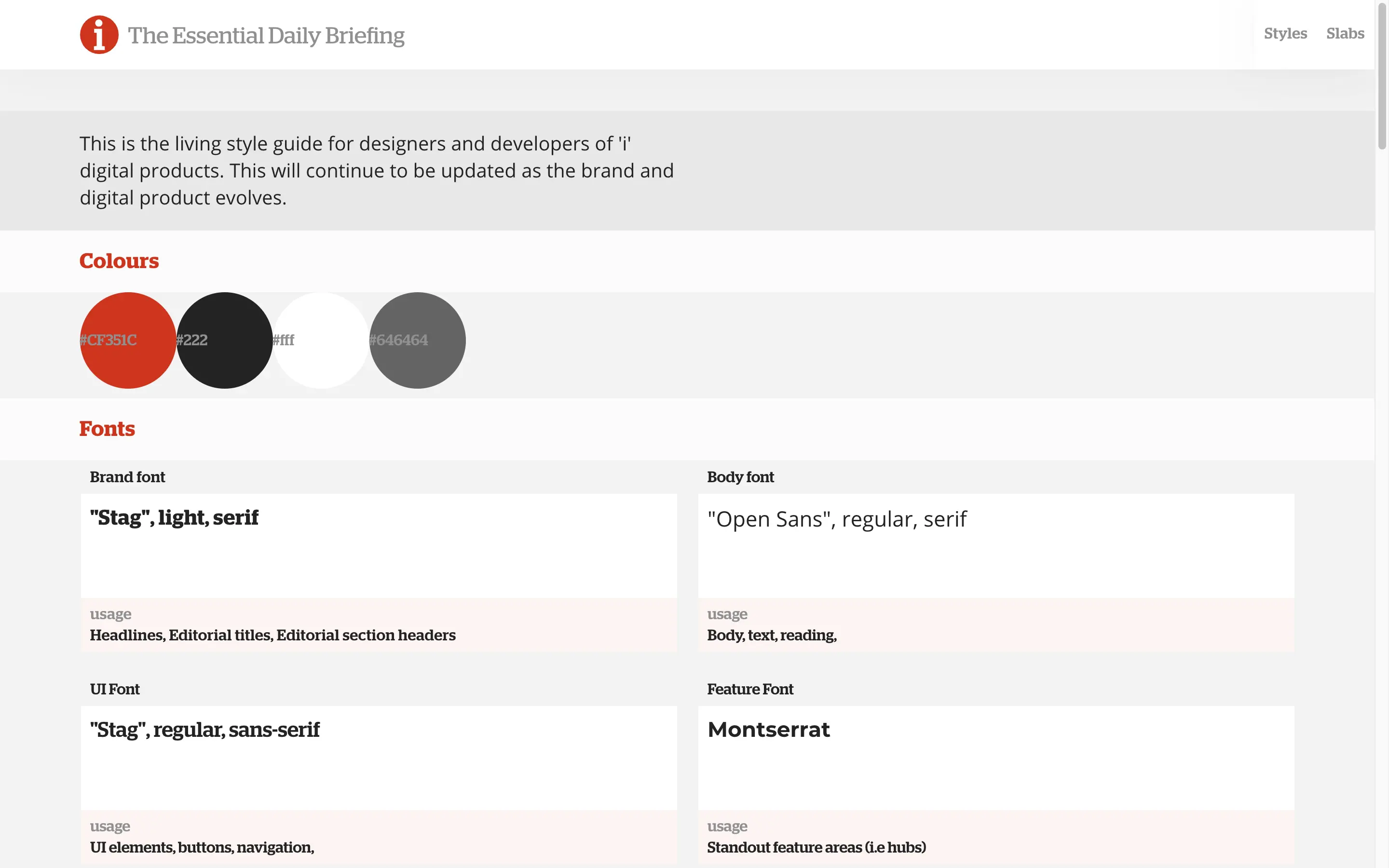
Pulling in the Stag font family, which the print product had based its' identity on to great effect, the prototpes quickly began resembling the paper Johnston Press were about to spend £25 million on.

Using SASS placeholders and variables to switch out brand colours was a breeze and, with many of the page templates we needed to fulfil the brief already in place, the pages began to come to life as we defined the styles. Out of the box, we had available the following ...
- Article
- Homepage
- Topic pages
- Native advertisement articles
- The ‘slab’ library
- Programmatic style guide
With 90% the design application taken care of by my prototyping set up and the precomposed editorial layouts, I began looking for areas within the concepts that were new to the system.
I quickly identified areas where I could foresee problems w hadn't been fully thought through, and so felt the need to iterate the design, rationalise the changes in doing so.
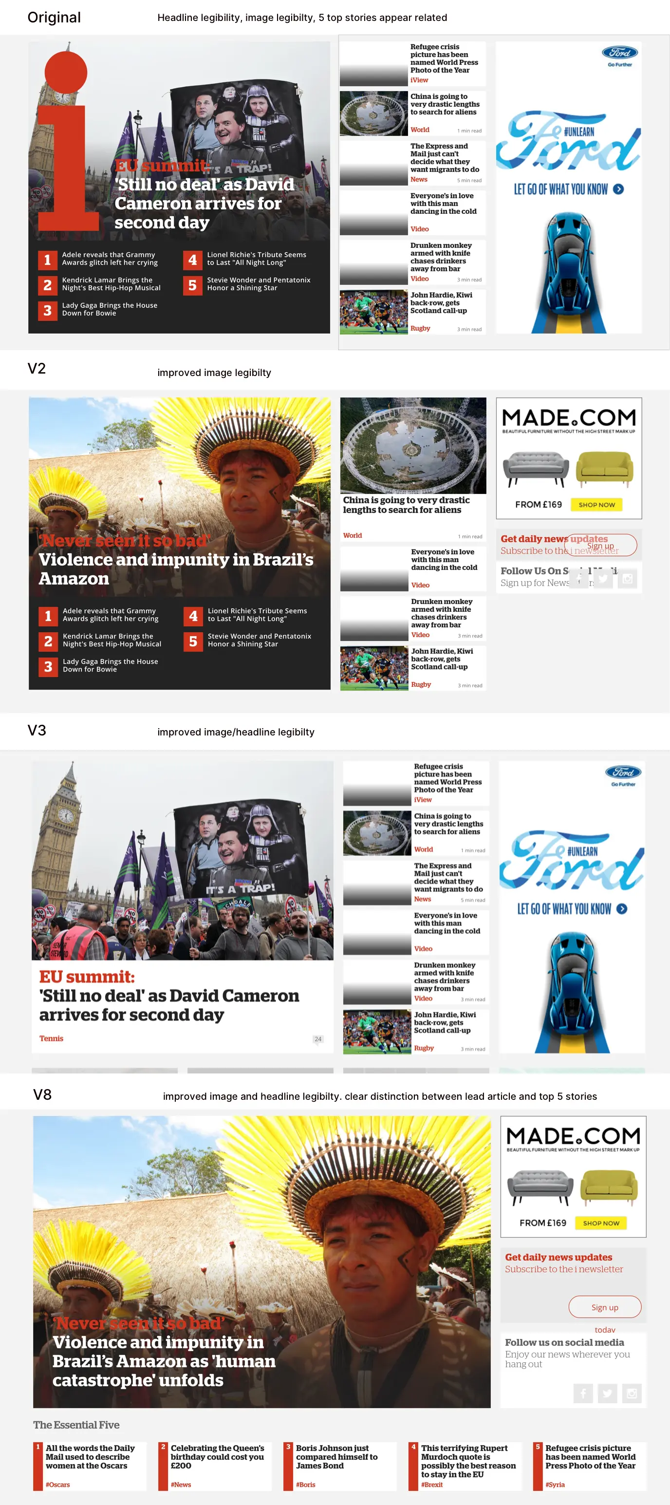
A carefully scripted presentation at the end of the week walked key stakeholders (CPO, CCO, Business Owner., Product Owner) through the prototypes for the proposed digital product.
Ensuring all parties were clear on the scope, pragmatic approach to designing the product and immovable deadlines we were bound by meant keeping the feedback loop extremely tight.
In doing so, as scheduled, we were on track to brief the development team ...
Briefing the developers
A late flight on Sunday to Iasi, Romania, took us into the development phase, with a schedule to interrogate, refine, plan and begin productionising the prototypes.
Having been through this process a few times with the development teams in the recent past, this was becoming a lot simpler, with everyone gaining a greater understanding of the JPDNA with each release.
We had a busy week planned, with the team there running a tight ship to ensure everyone understood the brief and was able to contribute effectively.
- Mon : Briefing - Walking them through the designs, allowing them to interrogate the brief
- Tues : Refinement - Establishing what exactly needed to be done
- Weds : Planning - How to sensibly tackle the work
- Thurs : UI Clinics - Small, tactical pairing sessions to solve less obvious UI implementation issues
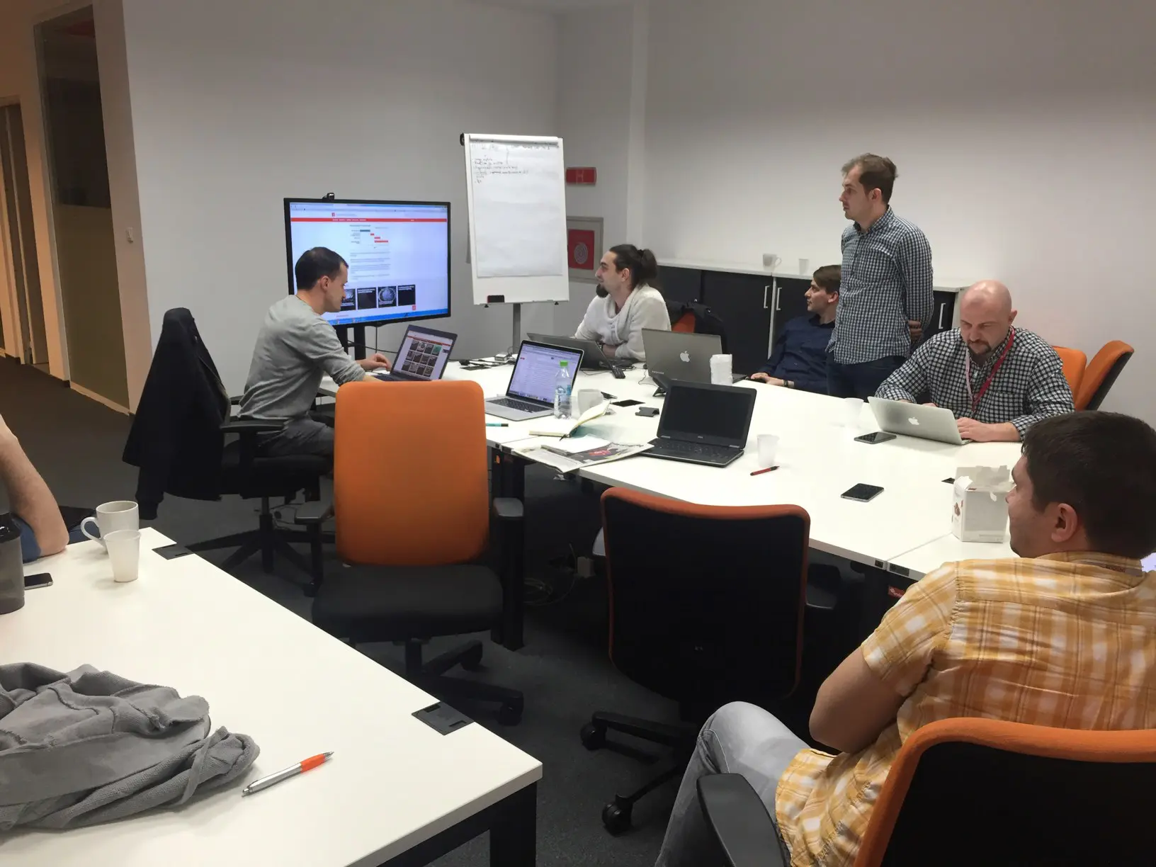
After an intense, but highly productive few days, we headed back to London confident that we'd get a site out on time.
‘Tweaks’
With the developers fully-briefed of their tasks we were graced time refine and polish some of the design elements that would really help bring the site some identity.
Can you make It bigger?
More obvious??
Can you make it red??? Jeff Moriarty, CPO
With notions of a 'dynamic news matrix' buzzing through his mind, our CPO began requesting all manner of crazy concept designs in order to digitise the popular print news feature, 'the news matrix'.
A multitude of ideas came and went in the following days, with a number of different designers put to task to realise the vision, yet nothing ground-breaking came of it.
With no time or process to test concepts with users at the time, we had to work on intuition alone.
It was clear from previous work, users didn't want new and unusual ways to navigate news, so attempting to keep the project grounded in reality we opted for a safe, straight-forward solution, which actually did well replicate the grid layout of the print feature.
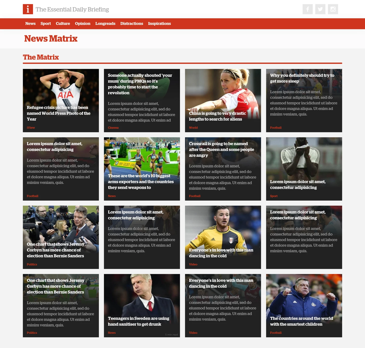
With daily check-ins with our Romanian counterparts and the editorial teams beginning to build out the CMS, our attention turned to the commercial aspects.
Marketing materials
As product development progressed in rapid fashion, marketing, commercial and editorial departments began to get a feel for what the digital product would look like and began pitching in with their requirements. This included ...
- Newsletters
- Local News site integration
- Author Bio treatments
- Holding Page


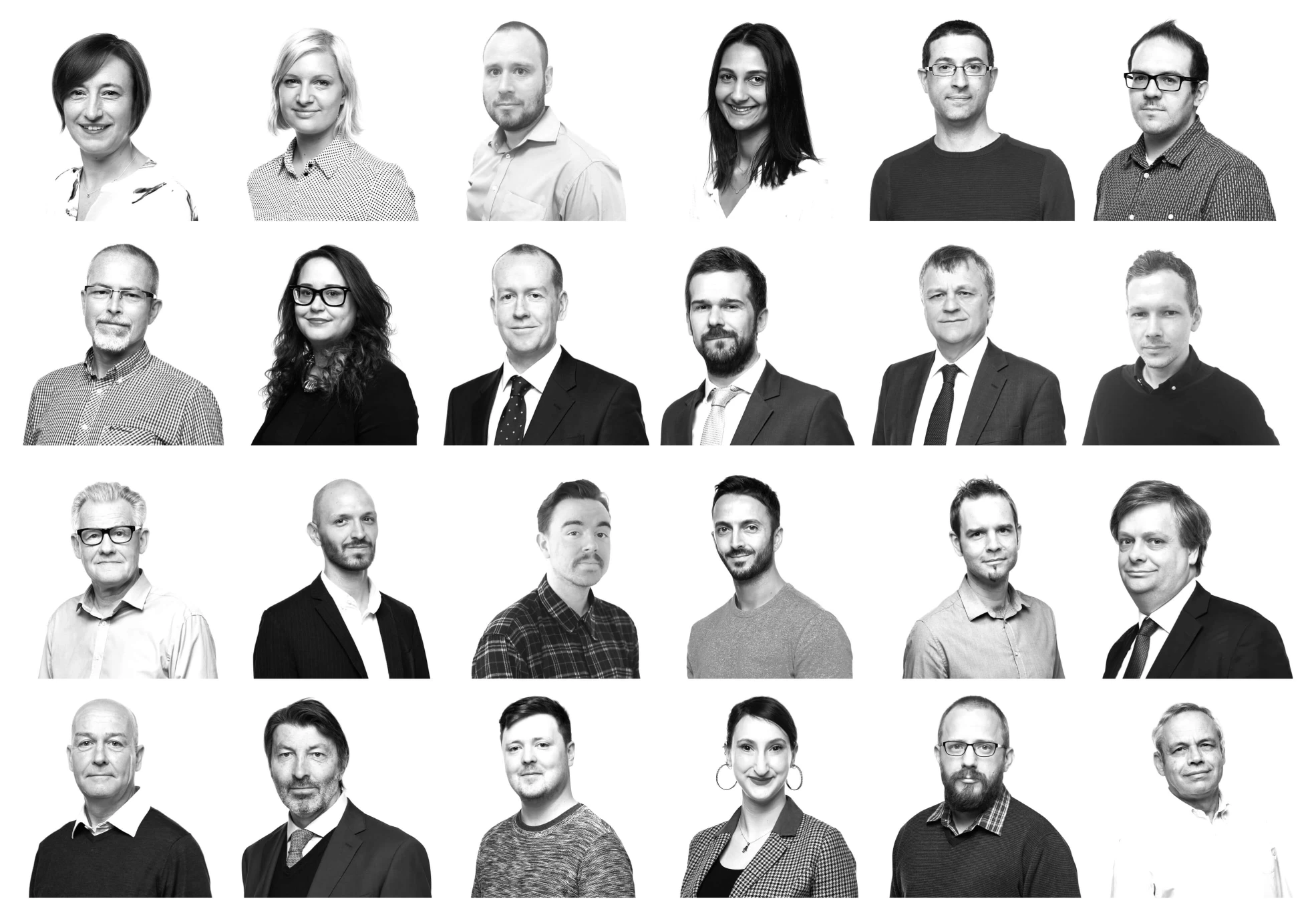
These were pretty staple requirements for the team and so producing these alongside the product was pretty straight-forward.
Testing the Prototypes
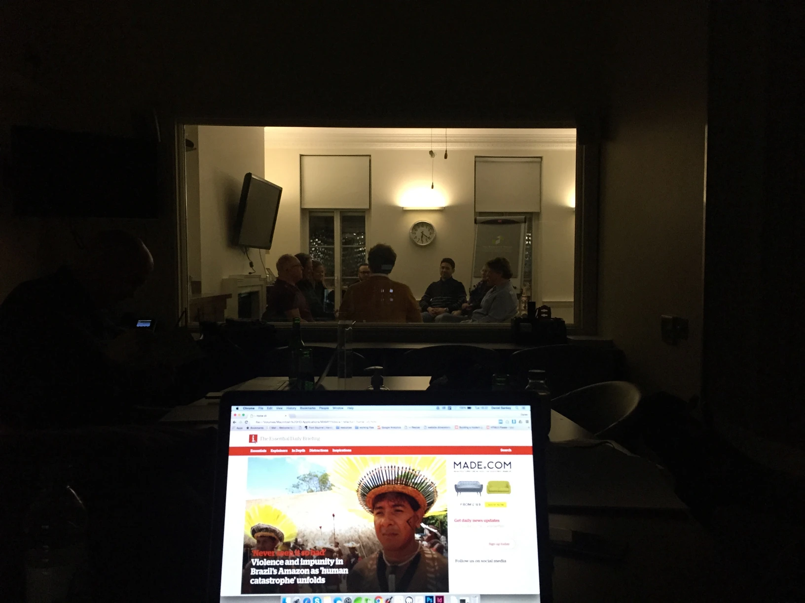
Despite the rush, 2 audience focus groups had been planned to look at the positioning of the print product and we were given time to get some qualitative feedback on the prototypes, with both groups giving us strong signals what was being built in Romania would be a welcomed companion to the paper.
Launch
Launch went smoothly and a small fanfare occurred as the JP became the proud new owner of a national newspaper and website.
Many in the news industry felt it was a strong, promising effort, given the turnaround.
I left Johnston Press not long after the release of inews.co.uk, with a new role at Mendeley lined-up to tackle their design system needs.
The Results
The site quickly gained a strong and dedicated audience and year-on-year it's growth has been phenomenal.
Every year the awards and nominations rack up, with a Drum Online Media Award 2018, 2 years after release, for the 'Best Designed News Site' and I marvel at just what we achieved in 6 weeks.
In 2019 it's reported to have grown it's audience by 457 percent in 12 months while the site remains largely unchanged.
Whilst I can't take credit for the quality of the editorial and the efforts to grow the audience since leaving, I'm confident that the work I delivered for the company back in 2016 allowed the teams to focus on delivering the news, rather than maintaining/iterating their digital products.
